5 Easy Handwriting Fonts You’ll Love

Bullet Journal lettering is a creative outlet that can bring joy to your everyday tasks. It’s like giving your to-do list a makeover, transforming the mundane into something exciting and visually appealing.
Today, we’re going to delve into five easy handwriting fonts that you’ll absolutely adore. These are not just any fonts; they are ones that will make your Bullet Journal pages pop with personality and style.
If you’ve been looking for ways to jazz up your journal, or if you’re simply a font enthusiast, keep reading! You’re in for a treat.

Before we dive into the beautiful world of handwriting, let me mention a few things you won’t want to miss out.
First of all, at the end of the post, you’ll find some amazing FREE printables that will help you practice everything from handwriting to brush lettering. So be sure to scroll down and get your freebies.
Secondly, also at the end of the post, you’ll get links to some more resources on handwriting to help you on your journey.
Now that this is out of the way let’s talk about handwriting, and let’s find you that perfect font!
Importance Of Handwriting
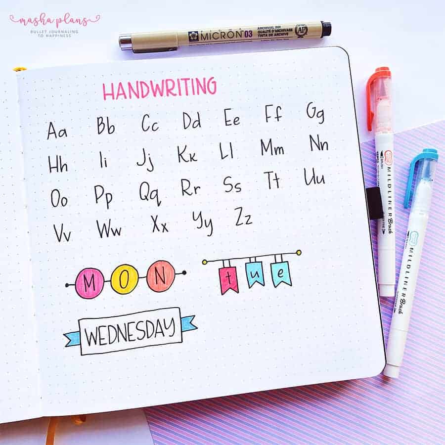
Isn’t it wonderful when you flip open your Bullet Journal and get greeted by neat, beautiful handwriting? It’s like a pat on the back from your past self, appreciating the effort you’ve put into making your journal not just functional but also aesthetically pleasing.
Having pretty handwriting in your Bullet Journal is more than just about vanity. It’s about transforming a simple task – writing – into an art form.
When your handwriting is neat and attractive, it can make the act of journaling feel more satisfying and enjoyable. It’s like adding a dash of creativity to your daily routine.
But let’s not forget the practical benefits. Good handwriting improves readability – you won’t have to squint or decipher what you’ve written down weeks ago. It saves time and eliminates frustration, especially when you’re in a hurry.
Moreover, beautiful handwriting can be a great confidence booster. Imagine pulling out your Bullet Journal in a meeting or a coffee shop. Your neat handwriting can turn heads and even start conversations.
Lastly, working on your handwriting can be a form of mindfulness practice. It requires focus and patience to help you stay present in the moment. So, if you’re seeking a new way to add a touch of creativity and mindfulness to your life, improving your handwriting could be just the ticket.
This post may contain affiliate links. They will be of no extra expense for you, but I receive a small credit. Please see my Disclosure for more details. Thank you for supporting Masha Plans!
Handwriting Supplies
Did you know that the type of pen can affect the way your handwriting appears on paper? For instance, some people find that pencils, with their wooden bodies and graphite points, offer better friction on the paper, leading to neater handwriting.
The body of a pen is also very important. The right pen should feel comfortable in your hand, providing enough grip and balance to allow smooth, effortless writing.
Line thickness is also important since the thickness of your lines, in many ways, can define how your handwriting looks.
Now, choosing the right pen may seem like a daunting task with all the options available. But don’t worry! Here are some tips to help you out.
- Consider the size of the pen.
A good pen should fit your hand perfectly, making writing a more enjoyable task. Too big or too small, and you might struggle with control.
- Pay attention to ink flow.
A pen with free-flowing ink can improve your handwriting by creating smooth, consistent lines. But be careful not to choose a pen that smudges easily, especially if you’re left-handed.
- Experiment with different pen types.
Ballpoint pens are popular for their reliability and function, while fountain pens offer the possibility to use different nibs, adding a personal touch to your handwriting.
The best way to figure out your perfect pen is, of course, to try out several and see what gives you the best feel. But to get you started, I have some recommendations:
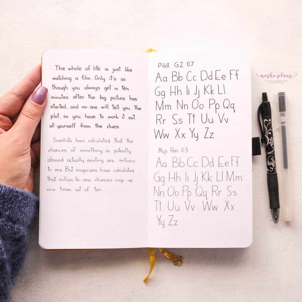
- Muji Pen. If you’re looking for a pen with thin lines, this gel pen is perfect. The ink is smooth, and the lines it produces are thin and gentle. It’s one of the most popular pens in the studygram community, and for a good reason.
- Pilot G2. These pens come with a very comfortable grip, smooth-flowing ink, and thicker lines. It might be a perfect pen for you if you’re looking for a wider line thickness. Plus, they also come in different colors to add a bit of variety to your handwriting.
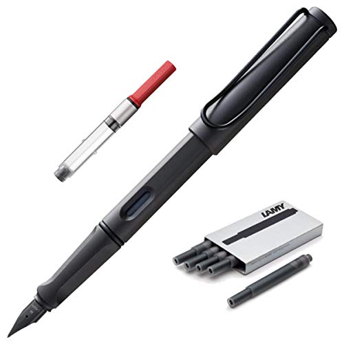
- Lamy Fountain Pen. If you’re looking into trying a fountain pen, this one is great to start with.

Easy Handwriting Fonts
It’s time to talk about these handwriting fonts you came here to look at.
I already have my own more or less set type of handwriting, and when I started working on this post, I realized that every time I try to come up with a different font, it all ends up looking very similar.
So, instead, I gathered a few of my favorite handwriting fonts and did it all digitally so you have more variety and a better understanding of the differences between these fonts.
Zeitoon Sans
My personal favorite font, and a huge inspiration for my own handwriting, is Zeitoon Sans. It’s a beautifully crafted font that manages to be both simple and full of character at the same time.
The letters in Zeitoon Sans are elegantly simple, making it easy to replicate in your handwriting. However, don’t let this simplicity fool you.
Each letter carries its own distinctive flair, adding an element of individuality to the overall font.
One of the things I love about Zeitoon Sans is its transformative nature. When you play around with different line thicknesses, you’ll witness this font morphing right before your eyes. A thinner line gives Zeitoon Sans a delicate, refined look, ideal for writing heartfelt letters or entries in your journal. On the other hand, a thicker line lends the font a bold, assertive quality, perfect for headings and titles where you want to make a strong impression.
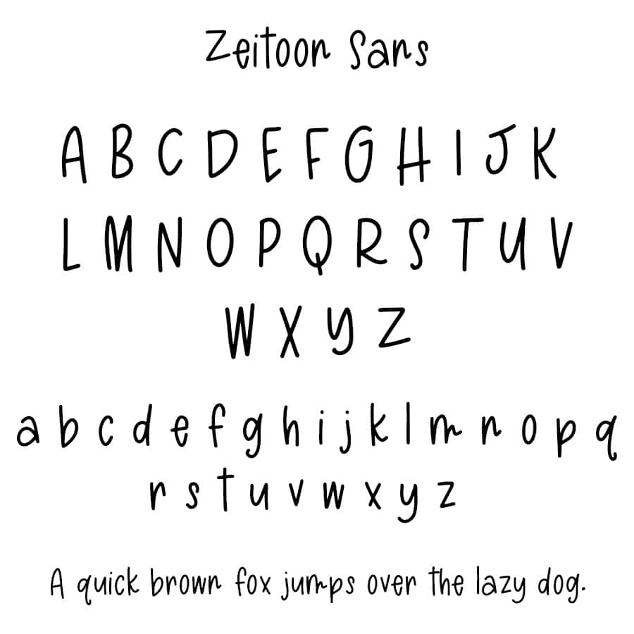
If you’re searching for a font that combines simplicity with personality, and can transform with different line thicknesses, look no further than Zeitoon Sans. It’s not just a font – it’s a source of inspiration for anyone looking to enhance their handwriting.
Beauty Flawless
If you’re seeking a font that strikes the perfect balance between cursive and non-cursive styles, let me introduce you to Beauty Flawless. This font is a stunning embodiment of elegance, simplicity, and versatility.
Beauty Flawless has a hint of a cursive vibe, making it an ideal choice for those who love the fluidity and sophistication of cursive but prefer something a bit more straightforward. The letters in this font are designed to flow beautifully into each other, creating an interconnected look that’s both pleasing to the eye and easy to replicate in handwriting.
One of the unique aspects of Beauty Flawless is its adaptability. While the letters look gorgeous when connected, giving off a gracefully cursive feel, you also have the flexibility to write them separately. And guess what? Even when written independently, the letters retain their charm and character, offering a fresh and fun look.

If you’re hunting for a font that combines the best of cursive and non-cursive styles, offers flexibility in writing, and exudes sheer beauty, Beauty Flawless is the way to go. It’s not just a font – it’s a style statement that can add a touch of elegance and personality to your handwriting.
Frank
The world of fonts is diverse and fascinating, and one font that stands out to me, especially when paired with a fountain pen, is Frank. This font has a unique charm that beautifully complements the fluidity of a fountain pen.
Frank is characterized by a subtle slant that gives it an appealing dynamism. This slight tilt adds a touch of elegance to your writing, making each word appear more engaging and visually striking.
What sets Frank apart is its use of thin and thick lines. The contrast between the two creates a delightful visual texture that’s not only pleasing to the eye but also enhances readability. When written with a fountain pen, these variations in line thickness become even more pronounced, lending a distinct character to your handwriting.
One of my favorite features of Frank is that the letters don’t connect. This gives you the freedom to write in a more relaxed, casual style. It also ensures that each letter stands out clearly, making your writing easy to read. Plus, it adds a dash of fun to your writing, as each letter becomes an individual expression of your personal style.

If you’re a fountain pen enthusiast looking for a font that perfectly complements your writing tool, Frank is an excellent choice. Its slight slant, variation in line thickness, and non-connecting letters make it a perfect match for the fluidity and versatility of a fountain pen.
Head Above Water
Head Above Water is my second favorite font, and for all the right reasons. It exudes a playful, almost cartoony charm that’s hard not to fall in love with. The letters are designed with a delightful quirkiness that adds a fun, informal touch to your writing.
The cute feel of the letters in Head Above Water is one of its most captivating features. Each letter appears to have been crafted with care and whimsy, resulting in a font that’s distinctly endearing. Whether you’re jotting down notes or penning a personal letter, this font is sure to bring a smile to your face and add a dash of joy to your writing.
I’ve found that Head Above Water looks particularly stunning when used with a thicker pen, such as the Pilot G2 we discussed earlier. The bold lines of the Pilot G2 beautifully accentuate the unique characteristics of this font, making each letter pop out on the page. This combination of a playful font and a bold pen creates a striking visual impact that’s both pleasing to the eye and easy to read.

If you’re looking for a font that’s fun, playful, and perfect for use with a thick pen, you can’t go wrong with Head Above Water. It’s more than just a font – it’s a way to inject a dose of joy and creativity into your everyday writing.
Neonoir
The last font on our list is the quintessential cursive font that is truly a masterpiece in its own right – Neonoir. This font embodies the timeless allure of traditional cursive writing, delivering a visual treat.
One of the standout features of Neonoir that I absolutely adore is its thin, pointed lines. The lines are so fine and sharp that they seem to pierce the page, drawing attention to each letter and adding an intriguing edge to your writing. Yet, this “stabbing” effect doesn’t come off as aggressive or harsh; instead, it exudes a sense of style and class that’s uniquely appealing.
Neonoir’s thin, pointy lines create a distinctive aesthetic that’s both elegant and dramatic. Each stroke of the pen feels deliberate and purposeful, resulting in a font that’s not just visually stunning but also deeply expressive. It’s the kind of font that can transform even the most mundane piece of writing into a stylish statement.

If you’re looking for a traditional cursive font that combines elegance, drama, and artistic flair, Neonoir is a fantastic choice. Its thin, pointed lines and classic cursive style make it a joy to write with and a pleasure to behold.
Tips For Practicing Handwriting
Absolutely; let’s dive into some friendly and fun tips to improve your handwriting and practice these fonts. Remember, improving your handwriting is part of the Bullet Journaling journey, and it’s all about having fun and expressing yourself!
- Start with Basics: Begin with practicing individual letters before moving on to complete words. This will help you get familiar with the shapes and strokes of each letter in the font.
- Consistency is Key: Try to maintain a consistent size and spacing between your letters. This will not only improve the look of your handwriting but also make it easier to read.
- Slow Down: Don’t rush! Good handwriting comes from taking your time and focusing on each stroke. Remember, it’s not a race!
- Practice Makes Perfect: Practicing a little bit every day can make a big difference. Dedicate a few minutes each day to practicing your chosen font in your Bullet Journal.
- Use the Right Tools: Pens like the Pilot G2 for thicker lines or a fountain pen for thinner, more delicate lines can enhance the look of your handwriting. Experiment with different writing tools to see what works best for you.
- Embrace Your Style: Don’t be afraid to put your own spin on the fonts. Maybe you like the slant of Frank, but prefer the roundness of Head Above Water. Mix and match elements from different fonts to create your own unique style.
- Have Fun with It: Most importantly, have fun! Handwriting is a form of self-expression, so let loose and let your personality shine through your writing.
Remember, everyone’s handwriting is unique, just like a fingerprint. So, don’t be too hard on yourself if it doesn’t look exactly like the font.
Lettering Freebies
Want to master handwriting, brush lettering, and even hand lettering? I’ve got you covered.
Sign up in the form below to get the exclusive lettering freebies that will help you master all these skills. As a bonus, I’ll also send you tons of fun and useful resources to help you on your journey to more beautiful letters.
Once you confirm your subscription, the freebies will be on the way to your inbox.
More Resources
Working on your handwriting can be hard, especially since by now you probably already have an established handwriting, whether you like how it looks or not.
But there is a lot of tips and tricks on how to work on that, so here are a few more posts I think you’ll love:
- Cute Handwriting Practice Sheets
- Best Pens To Improve Handwriting
- Handwriting Tips And Tricks To Enhance Your Penmanship
>>>> What kind of handwriting style do you want to create? What are your current struggles working on handwriting?
Let us know in the comments!
Hope this post was interesting. If you find it so, please share! If you enjoy my content and want to show your appreciation, please consider supporting me with a cup of coffee.
And remember: Keep Journaling, and Don’t Be A Blob!


Hi, I have been a fan/follower for a while. I love your creativity and how you are able to explain things in an easy to understand way. This article blew me away! I was recently in a cricut group talking about how hard it is to decide on a font – washi & fonts, I am so indecisive I end up spending all my creative time because of indecisiveness but I love how you broke everything down. Of the 5 fonts you shared I definitely like the first one you shared best. Unfortunately my kids haven’t been taught cursive so any fonts that have anything “extra” to them and they won’t be able to read – which can be a good thing and a bad thing 🤣
I totally get it, it’s not so easy to decide on those things when there are so many options to choose from! And it is kinda funny to me what’s happening with cursive. I was taught it in school but now even I’m having troubles with it sometimes! And thank you so much for following and leaving a comment, happy you liked this font =)
Thank you so much! Love your handwriting!!I love it so much and I will be looking for something similar :)
What kind of font did you use where you wrote “The whole of life is just like watching film…”? Is it your own? If so, do you sell it?
What a lovely compliment, thank you! It’s just my handwriting and no I don’t actually have it as a font so I don’t sell it either.