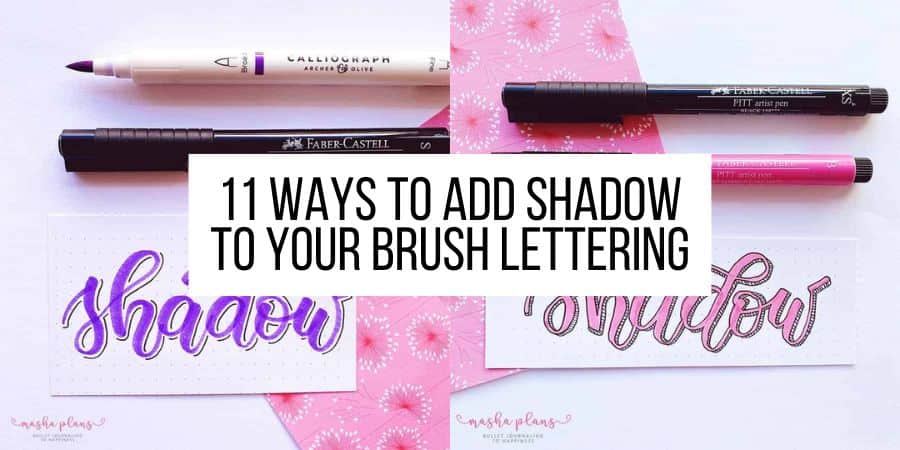
11 Simple Ways To Add Shadow To Your Brush Lettering
Bullet Journal lettering is beautiful, you can create so many craft projects, and it looks fantastic on a journal spread.
Today we’ll walk one step further and learn how to enhance your brush lettering by using different types of shadow.
In case you’re new to brush lettering and aren’t there yet – don’t worry. This post still can be helpful.
First of all – you can always learn brush lettering if you check my Beginner’s Guide To Modern Calligraphy, or take any of these Free Online Calligraphy Classes.
Secondly – you can use the same techniques with faux calligraphy or any other type of letters, like block letters, for example.
Adding shadows is not something you have to do with your letters. But I absolutely love this technique, and it helps make your letters stand out just a little bit more.
So let’s start with the basics.
This post may contain affiliate links. They will be of no extra expense for you, but I will receive a small credit. Please see my Disclosure for more details. Thank you for supporting Masha Plans!
Where To Add The Shadow To Letters
Choosing where to add the shadow is very important because if you don’t follow the basic principles, your letters might look weird, and you won’t even know why.
When you’re working on your shades, the critical part is to choose where your light comes from and just add shade to the opposite side.
So if your light comes from the left side, you’ll need to add shadow to the right side of all your letters.
Here is a little cheat sheet with different possible light sources so you can get an idea of what’s possible.
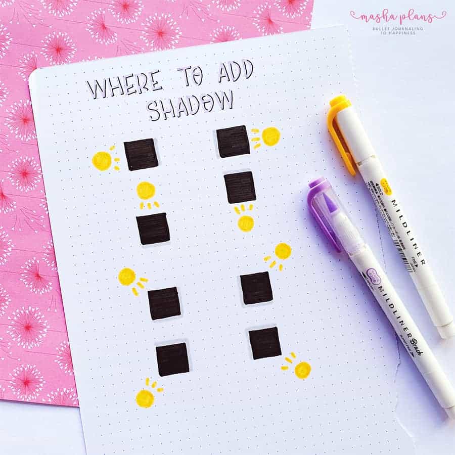
The important thing here is to stay consistent. Pick one and just go with it for all the letters in your word.
I’d recommend trying out different techniques to see what works best for you. My favorite is probably to have the light coming from the top left corner of my lettering.
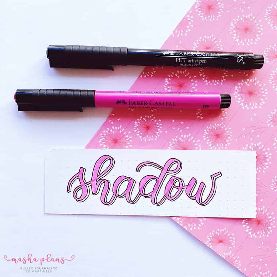
Brush Lettering Materials
Before we get to actually adding shadows, I thought I’d mention a few useful pens for these techniques.
Tombow Dual Brush Pens – for actually doing brush lettering. There are a lot of other amazing brush pens out there, so be sure to check my post with Best Brush Pens For Modern Calligraphy.
Faber Castell Pitt Artist Brush Pen (in grey) – grey is a great way to add shadow, and so far, the Faber Castell grey brush pen has been my favorite, both because of the color and the nib size.
Faber Castell Fineliners – you don’t need these precisely, but a lot of effects we’ll be talking about relying on you having a fineliner.
Oh, and if you’re looking for materials to improve your lettering altogether, check my post with Free Lettering Worksheets.
9 Simple Lettering Shadow Effects
Finally, let’s get to it and start adding shadow to your brush lettering.
These all are pretty simple, but they create a strong effect that definitely makes lettering stand out.
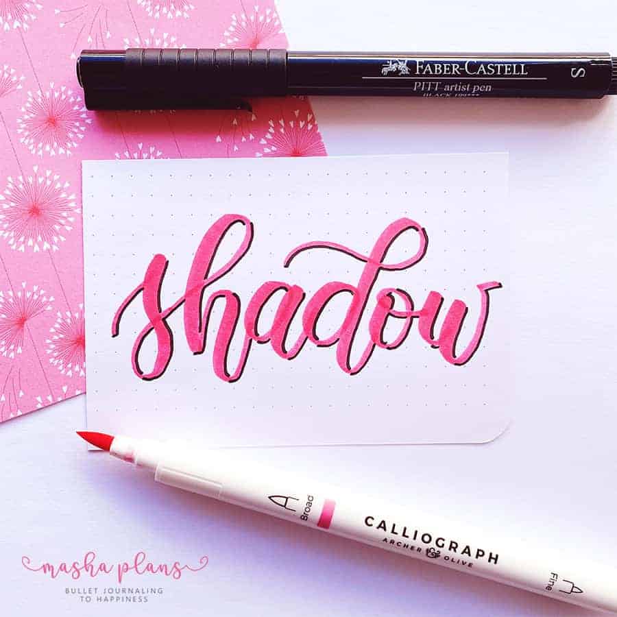
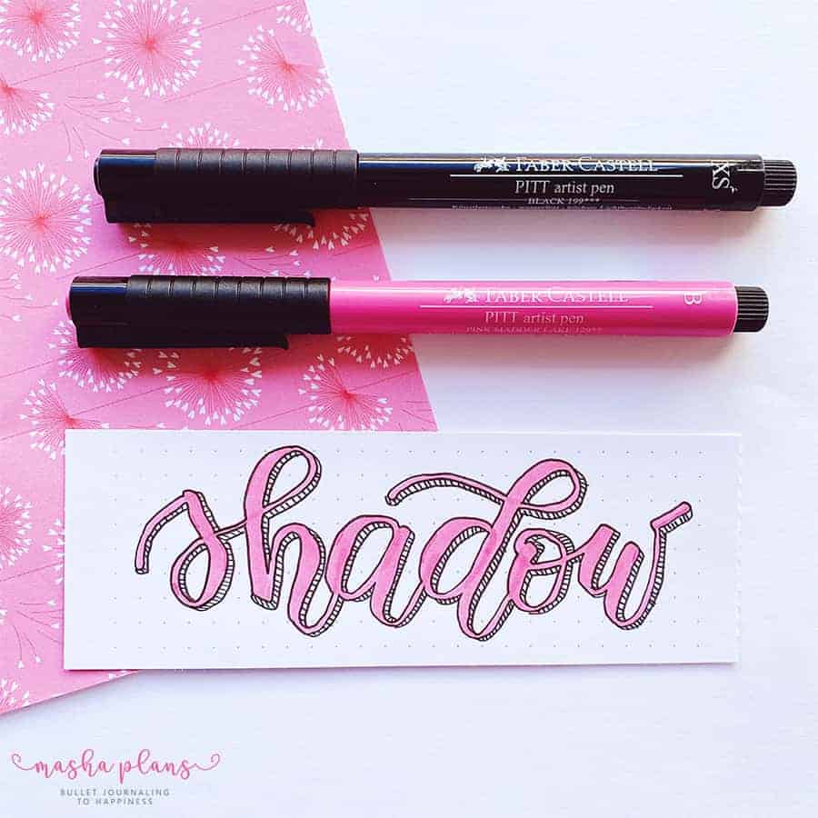
Monoline Shadow
This is the basic one and is as easy as it gets. Just take a black pen or marker (for these, I prefer to have a fineliner) and outline the part of the letter that should have a shadow.
I love using this effect, and it’s handy when you realize that the pen color is a bit too light, and your lettering might not be well seen on paper.
Offset Monoline Shadow
This one is similar to the monoline effect but with one difference – you have to draw your lines some space away from your letters.
This gives letters a bit more depth, but you have to be very careful to keep the same distance throughout all the letters.
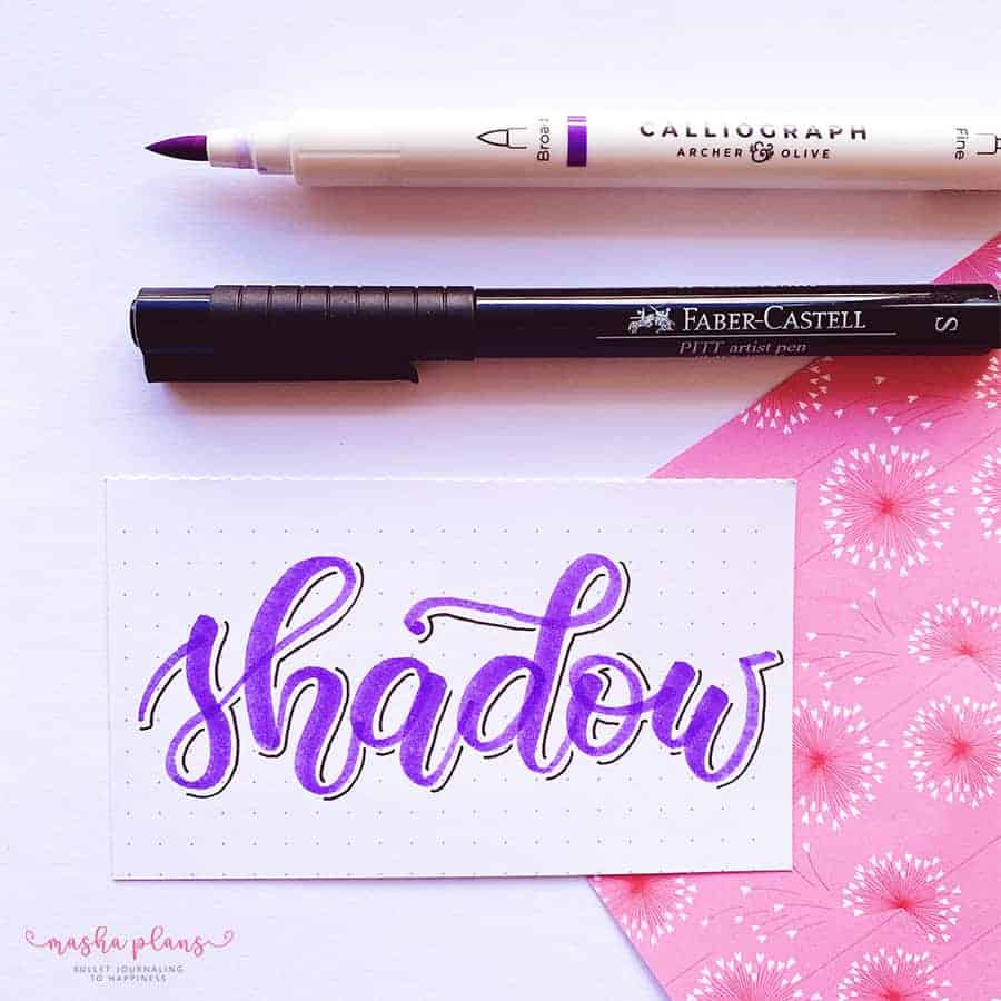
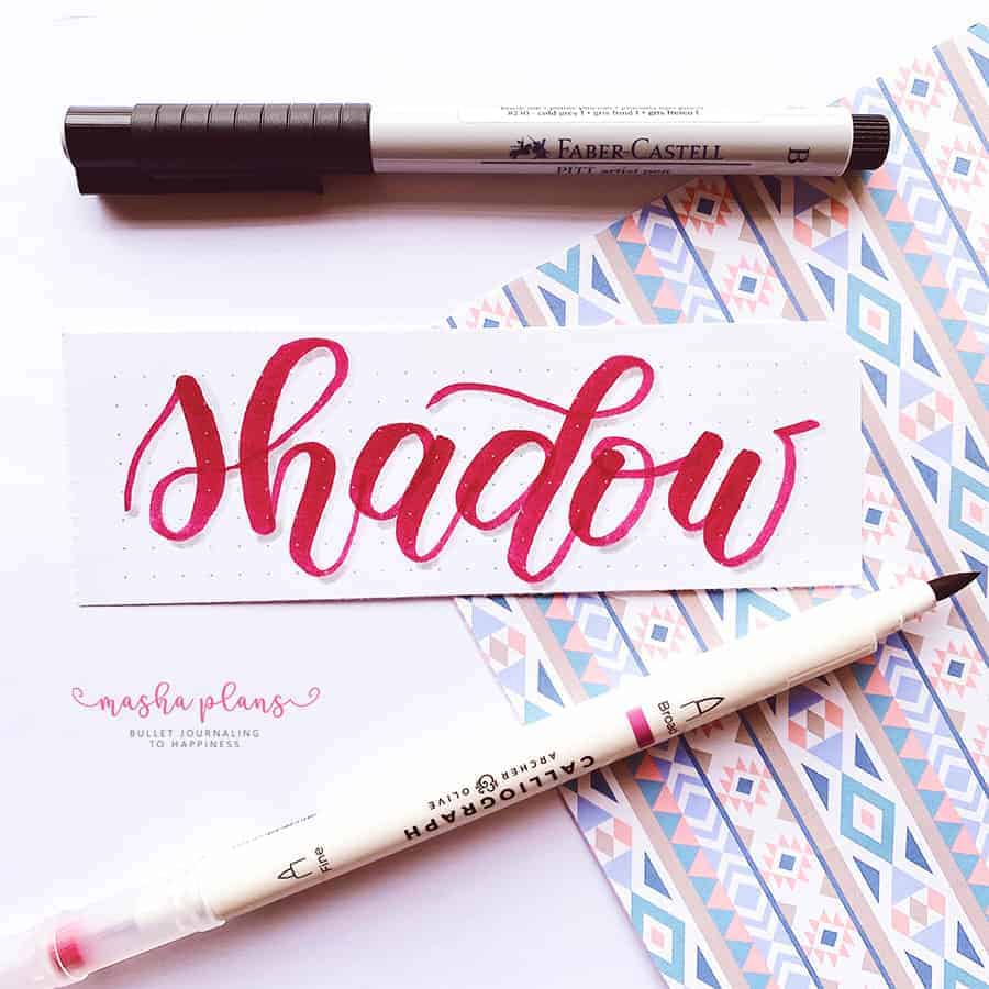
Colored Offset Monoline Shadow
Another fun way to create the offset monoline shadow is by using colors. Here I used a Tombow Dual Brush, both a brush tip for writing and a marker tip for creating a shadow.
You can also layer different shades of the same color to make the shadow even more profound if you want to.
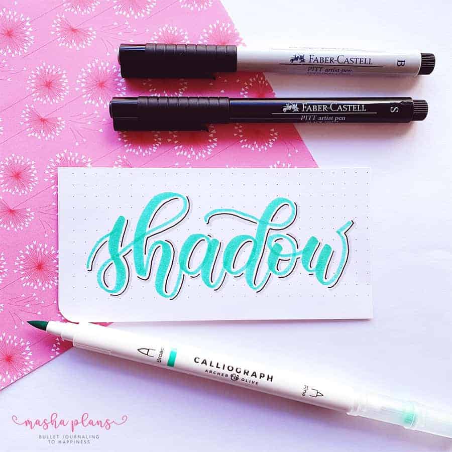
Grey Shadow Letters
This one is a classic, and all you’ll need here is a grey brush pen or a marker.
Choose where to place your shadow and add thick grey lines there.
You have to be careful with a few things here – not to overlap grey shadow with the color of the letters and to keep the shadow thickness the same throughout the entire word.
Grey Offset Shadow
This effect is basically a compilation between an offset monoline shadow and a grey shadow.
You first do an offset monoline shadow, as we talked about before, and then you add grey lines to it.
Again be double careful to stay consistent with how far your monoline is and how thick your grey lines are.
Two Colored Grey Shadow
This doesn’t have to be grey. I just thought it’s a great color to explain the basics of this technique.
You start by adding your shadow as you usually do, but later, you add an extra layer to the points in your shadow that would be naturally darker.
For example, here, my light source is coming from the top left corner, so probably the bottom of the shadow will be naturally a bit darker than the rest of it.
It takes a bit to figure out this effect, but it’s a really fun and unique one.
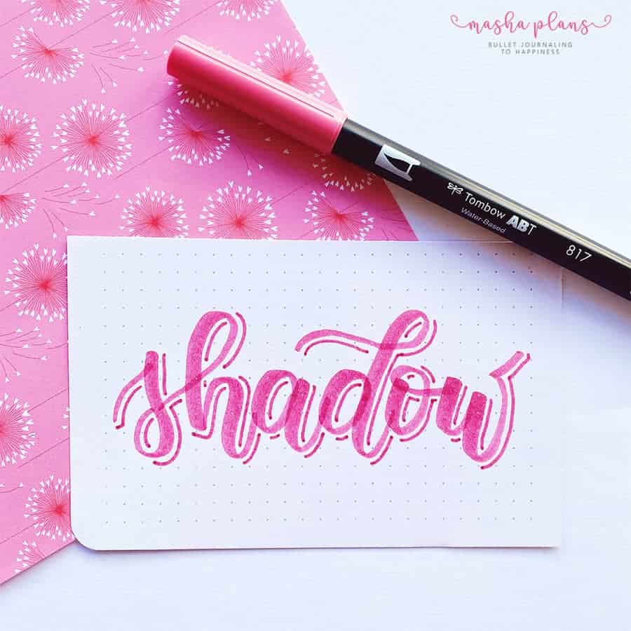
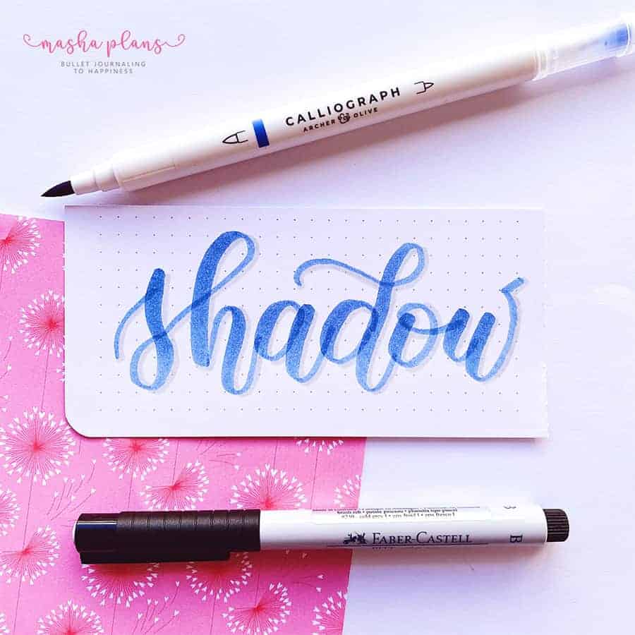
Colorful Shadow
This is a fun effect that, in many ways, can make your letters look 3D more than any other effect, especially if you choose your color combination well.
This is one of the reasons why I always recommend this trick – with different colors, your letters will look completely different, so it’s a fun way to explore your creativity.
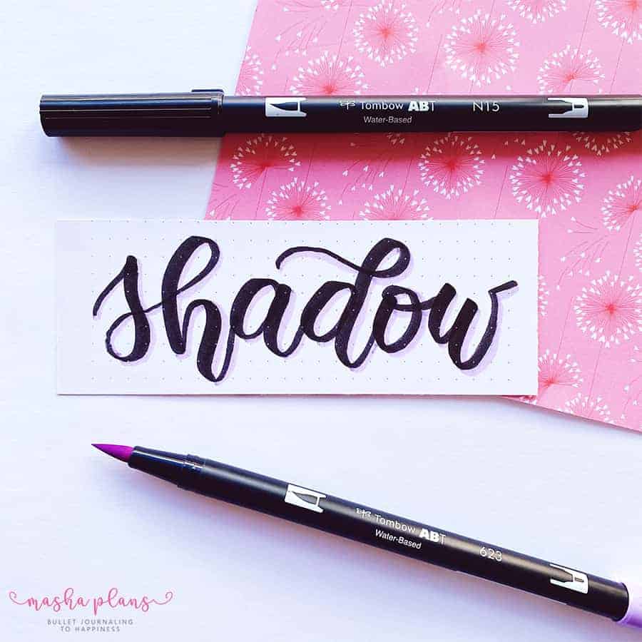
Black Shadow
This is a classic one, and it’s similar to a monoline shadow, except the lines are thicker, so you get more of a 3D effect.
Again I love doing it with lighter-colored brush lettering, so it makes it stand out more.
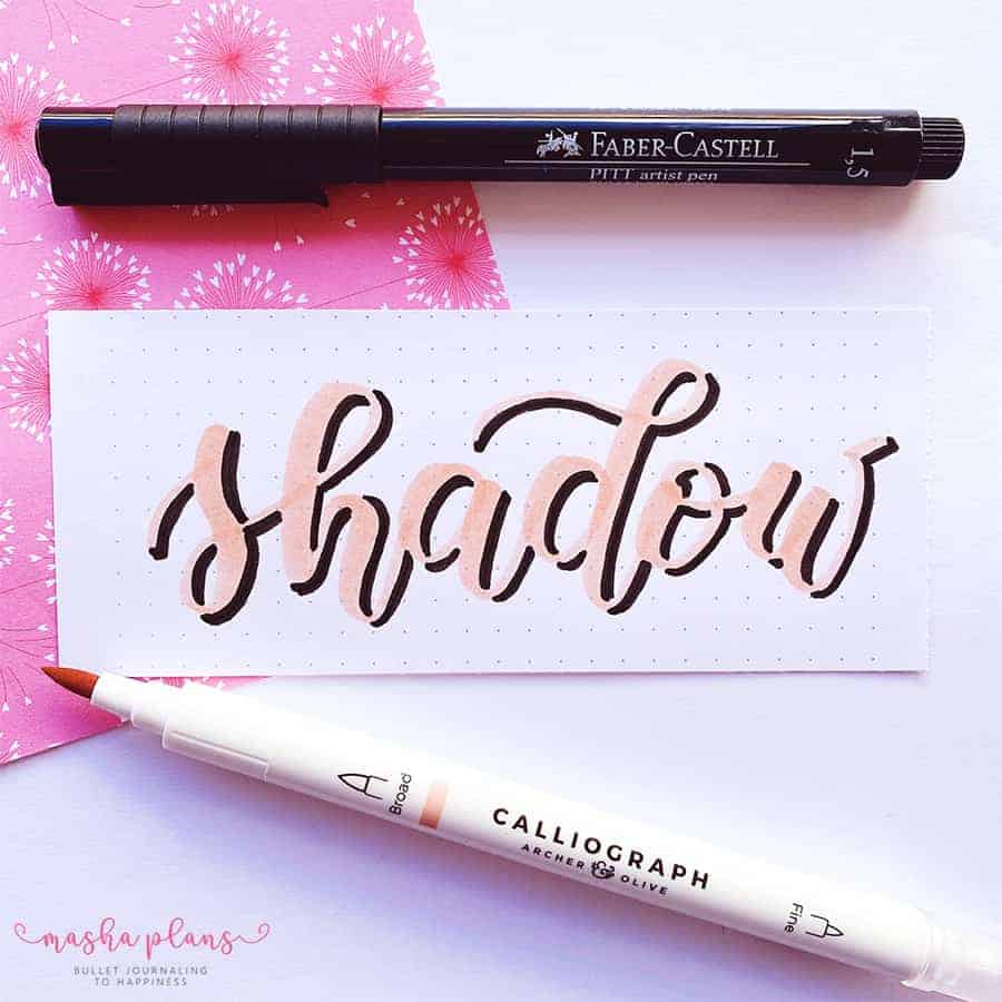
Outlined Shadow
You start by brushing lettering your word and then outlining all the letters. Be careful here to stay on the border of the letters.
Then you just go in with a grey pen and add a shadow as you normally would.
It is not a huge change, but it ends up looking very different. Plus, again, it’s a fun effect to use with a brush pen of lighter color.
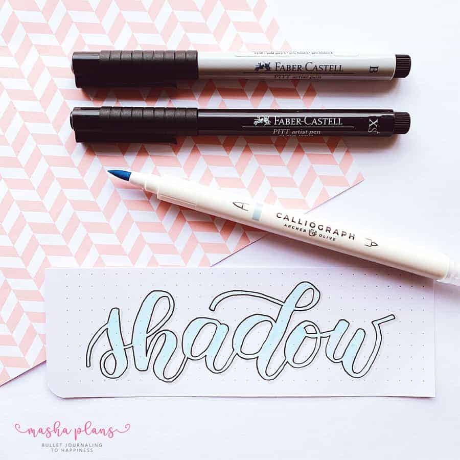
Outlined 3D Shadow Lettering
You start by outlining your letters and then do an offset monoline shadow.
Only this time, you don’t let the lines float but collect them to the letter like the shadow would.
It might take a while to get used to seeing things like that, but it’s worth it and looks fantastic.
Outlined 3D Hatched Shadow
When you create a 3d effect letters, you get than shadow space that we left empty in our last technique.
But you can fill it out for a completely different look.
Here I went for a basic hatching technique. Two tips here. First. Try to keep your lines parallel and at equal distance from each other. Second – you might want to use a thinner pen for this effect.
I hope you liked these, and I’m excited to see you try them, be sure to share your work in our Facebook Group.
Of course, share with us in the comments which of these techniques is your favorite.
Free Brush Lettering Resources
Want to learn more about brush lettering and master that skill? I’ve got you covered.
Sign up in the form below, and once you confirm your subscription, you’ll get 4 free exclusive worksheets and get tons of lettering resources delivered straight to your inbox.
Hope this post was useful, if you find it so, please share! If you enjoy my content and want to show your appreciation, please consider supporting me with a cup of coffee.
And remember: Keep Bullet Journaling, and Don’t Be A Blob.