Creative Pen Swatch Bullet Journal Pages
There are so many different Bullet Journal page ideas out there, and today we’ll be looking into pen swatch pages.
If you’ve ever fumbled through pens wondering which shades work best or how they’ll appear on your journal’s paper, this post is for you. Pen swatch pages are not just helpful; they’re a playground for experimenting with colors and textures.
You’ll discover why these pages deserve a spot in your journal and get tons of creative inspiration to design them in ways that reflect your personal style. Grab your pens, and let’s explore!
As a passionate Bullet Journal enthusiast and a self-proclaimed stationery addict, there’s nothing I enjoy more than flipping through shiny new stationery finds and exploring all the gorgeous colors they bring into my life.
The way a new set of pens or markers can light up a journaling page is pure magic, and it never fails to inspire me to get creative all over again. Honestly, just testing out new tools sparks ideas for layouts, themes, and even unique page designs. Who else feels this way?
I hope you’re with me on this! If so, tell me about your favorite stationery discoveries in the comments—I’d love to hear all about them.
But let’s be real, pen swatch pages aren’t just about the sheer delight of seeing beautiful colors arranged on paper (though that’s a pretty big selling point!).
They’re an incredibly useful tool for keeping track of all your pens and markers, testing how they look on the page, and even avoiding the dreaded smearing or ghosting that can mess with your journaling vibe. There’s so much more to them than meets the eye!
This post may contain affiliate links. They will be of no extra expense for you, but I receive a small credit. Please see my Disclosure for more details. Thank you for supporting Masha Plans!
What Are Pen Swatches
That’s an easy one. Originally swatches were basically like mini samples, so you can see the color and texture of the material.
For pen swatches in your Bullet Journal, it’s the same – so you can see how the pens work, what colors they have, and how they work on your Bullet Journal.
But of course, with all the creative people out there, it got a little bit out of hand, and people started getting super creative with the way they make their pen swatches look.
We’ll see several excellent examples in this post.

Why Do You Need A Pen Swatch Page
It might seem like these spreads are just for show-offs, but it can’t be further from the truth.
Well, I mean yes, it could be made just for a show-off, but there are many other reasons why you should have one in your journal.
- Check The Color
The first and most obvious reason is to see how the colors look. They often are slightly different on the paper than they are on the pen, so it’s always a good idea to do a swatch.
Plus, often, if your paper is not pure white, the color of the paper will affect how the color of the pen looks.
- How Pen Works On Your Journal
Does it bleed or ghosts on your journal pages? Is there feathering? How fast do they feather
Not all journals are created equal, and some pens can really ruin your Bullet Journal pages. So, before you start using a new pen, be sure to do a little test at the back of your journal to see that they are compatible.
- Keep Track Of Your Pen Collection
If you’re into Bullet Journaling, chances are you might have more pens than you need, and probably some of them are never used.
But if you create a pen swatch spread, you’ll always have one place where you can check all the colors you have without going through ALL the pens.
- Faster Monthly Setups
When you create a monthly theme, it’s important that you have your colors coordinated. That way it will definitely look better.
This will be easier to do if you have all the colors in front of you and see which ones are a good match. Believe me, it’s so much faster that way, than just trying out tons of different colors trying to find a few matching ones.
How To Create A Pen Test Page
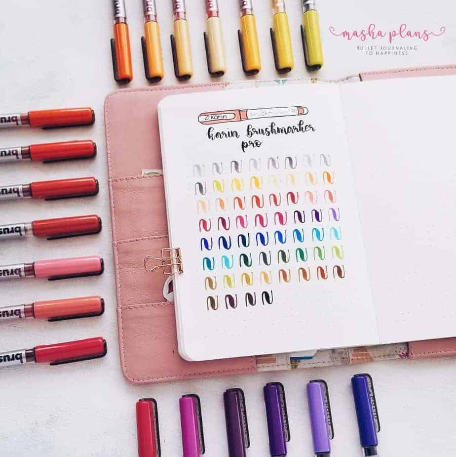
To be honest, it’s pretty easy and can be quite fast as well.
Here are a few tips:
- Create a pen swatch at the end of your journal
- Try adding color names or numbers so you can easily find the pen afterward
- For brush pens try to do some drills to show how thick the brush tip is
- If you just want to have all your pen colors in one place – consider having a separate journal for that
- Despite the example below, to create a swatch page all you need is a line of color, or maybe color a little square to see more color
- If your pen has two different tips try to swatch them both
These are just some concepts I try to follow when I create my own swatch pages.
But remember – your journal, your rules; you can create them any way you want.

And speaking of that, let’s get right into it.
Pen Swatch Bullet Journal Pages
These can get pretty elaborate, but please don't be scared - you don't actually have to make them the same.
What I like the most is that there are so many different types and elements you can include in your swatches. Every artist has their own approach, and I think you can definitely check out all these ideas and find out one thing that works best for you.
We're starting from my own swatch of my Tombow Dual Brush pens.
I actually had a whole separate notebook where I was swatching ALL my pens so I can have a good view of all the colors and materials I have. Since the notebook was the same brand as the ones i used for planning it worked perfectly.
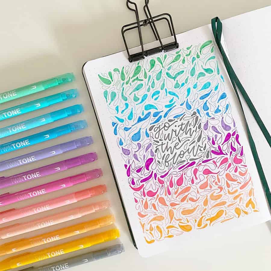
Another great swatch spread for some of my favorite pens - Tombow Twin Tone.
I love how it looks so fun and creative while using very easy shapes.
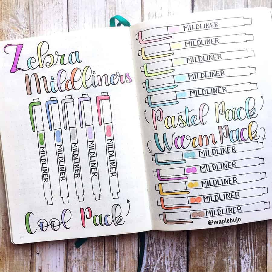
Zebra Mildliners are definitely my favorite pens ever, so of course, I had to include this swatch spread.
I also feel like these pens are probably the easiest to doodle, so this is definitely a fun way to swatch these highlighters.
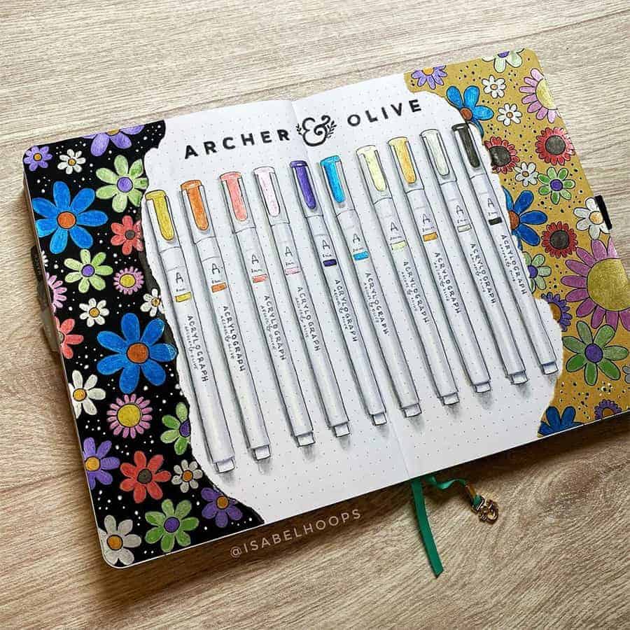
It's always a good idea to test your pens on different types of paper if you're planning to use it, since some pens don't really transfer so well to other paper colors.
I'm also in love with how creative Isabel is with this swatch spread.
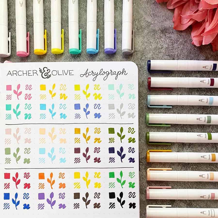
Another beautiful swatch of acrylograph pens.
There are no pen names or numbers here, but I like how Nicole created little botanical elements for each color.
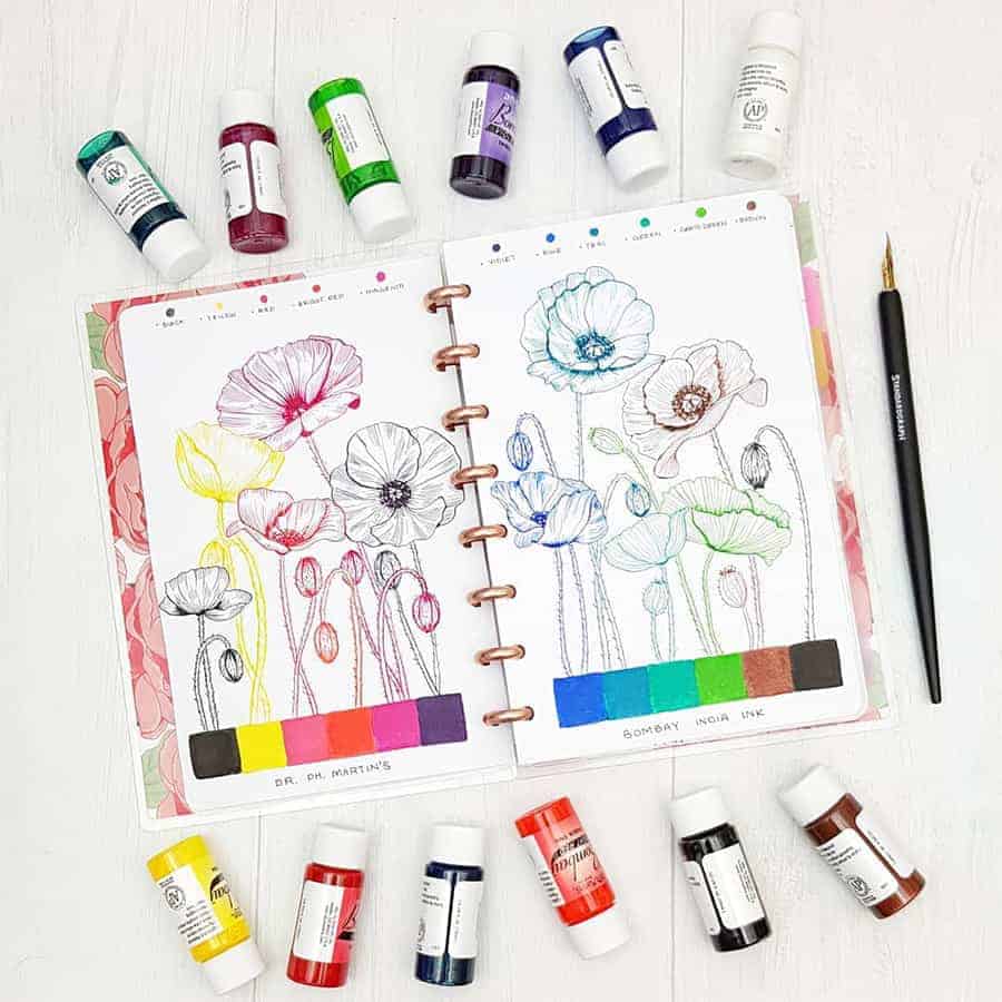
Beautiful ink, and I love how the illustration shows different lines you can create and how they would look.
I also appreciate there are just big squares of color; pretty useful to see it in big chunks.
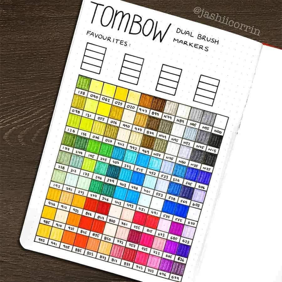
As you can see, your swatch spread doesn't have too difficult, just create little squares with color and space to write the numbers of the color is ok.
I also like that she has a little area on the top for some favorite color combinations.
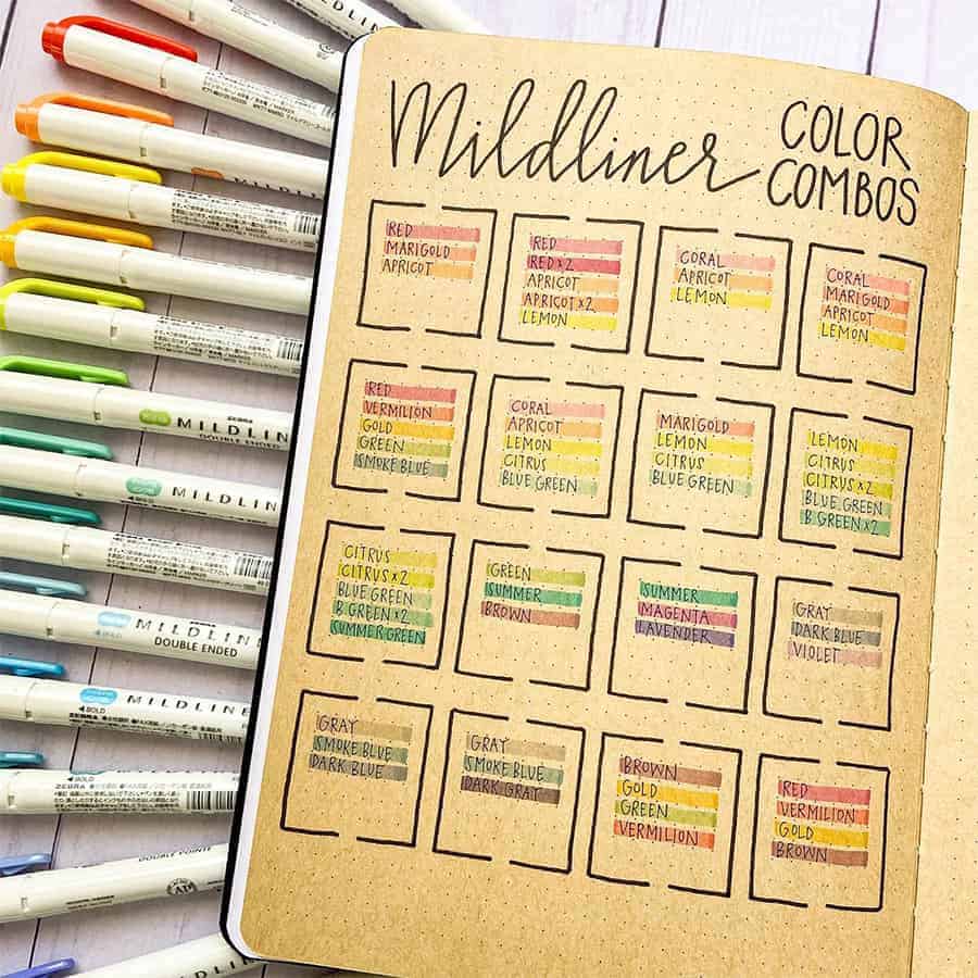
Speaking of color combinations, you can definitely create swatches with your favorite color combinations.
I love how Zebra Mildliners look on kraft paper, by the way, even more, soft and muted.
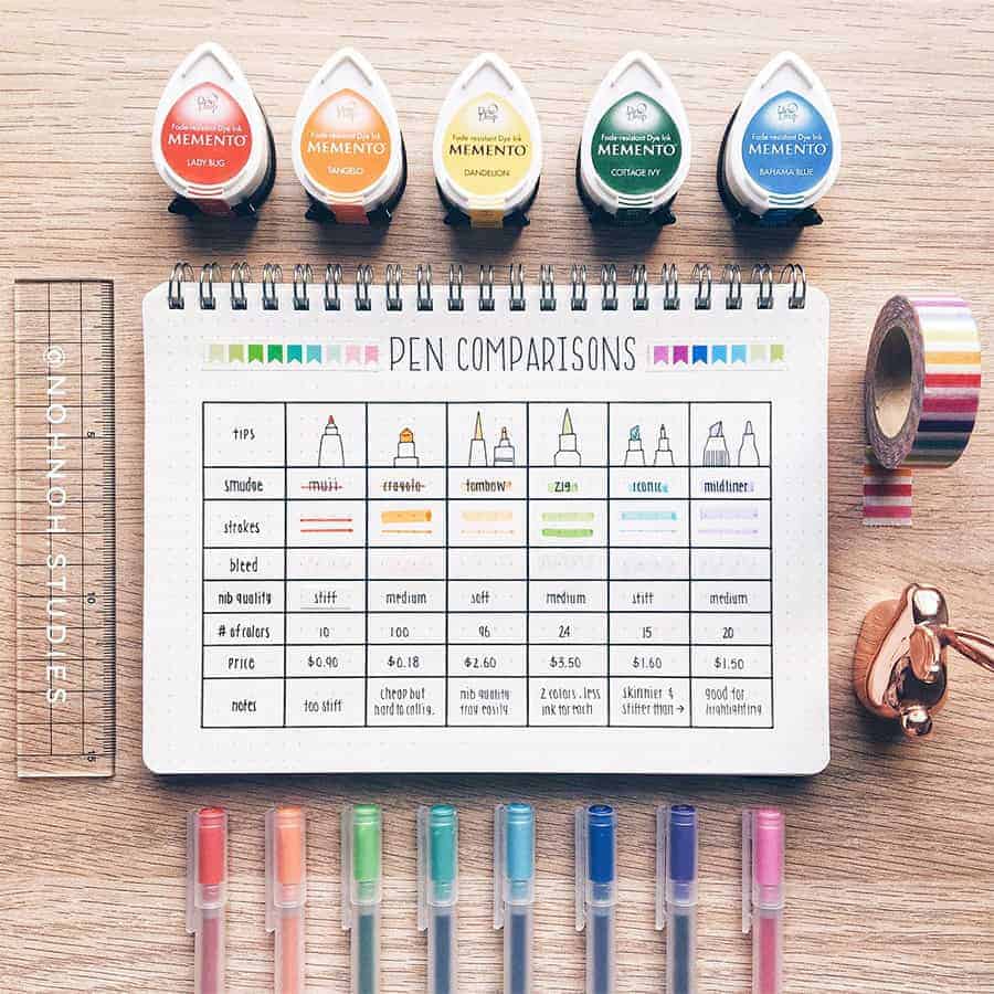
As you can see, there are several approaches to a pen swatch. You can do it for all the colors, or you can do it to check the pen quality and how it works inside your journal.
I like all the different categories and ways to evaluate a pen; it might be a good guide for the future.
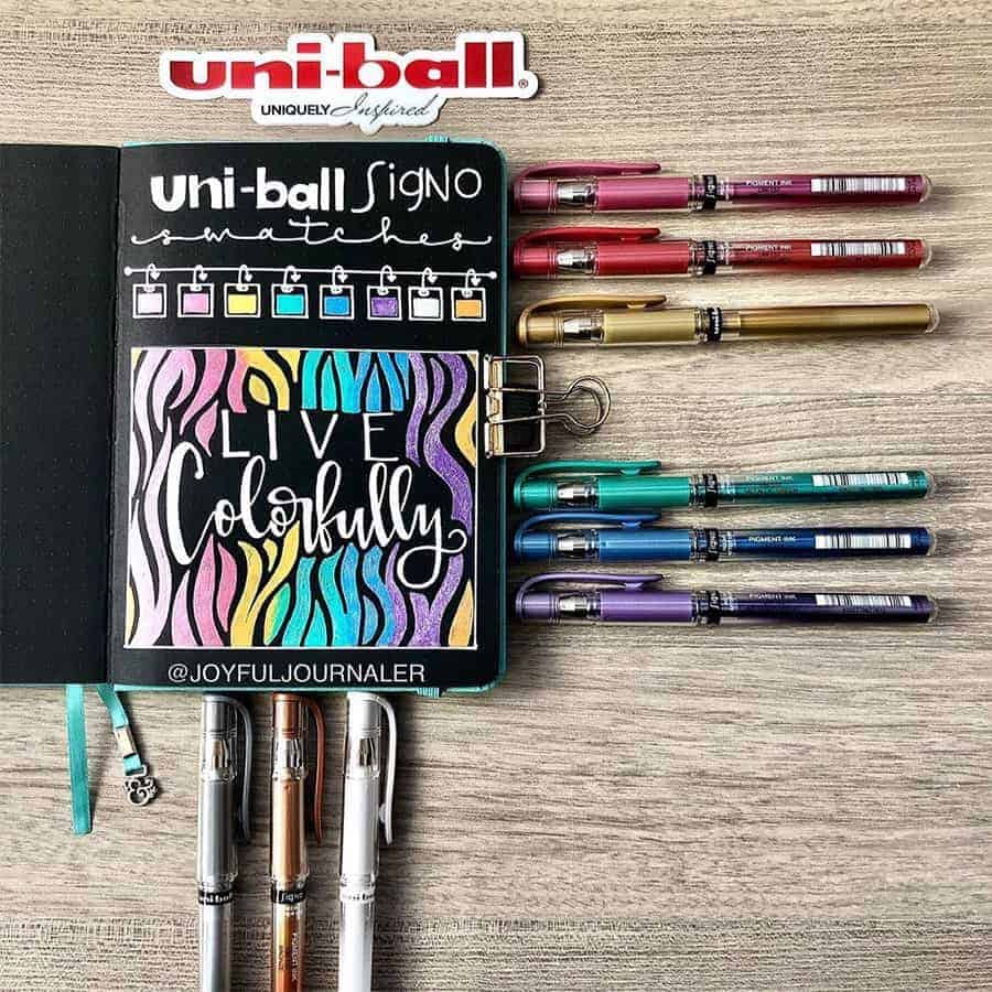
The beautiful color representation here makes me want to buy those Uniball Signo pens. And it's a great idea to test those on black paper; the metallic pens look the best on black paper, I think.
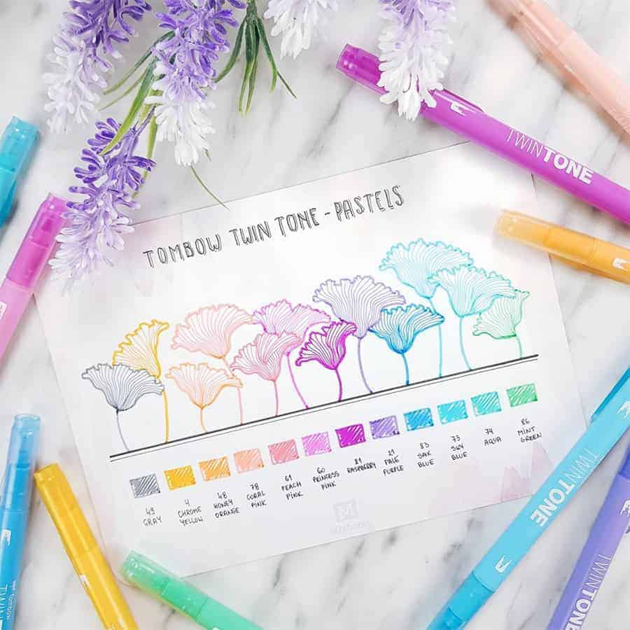
Another beautiful swatch for the pastel Tombow Twin Tone pens, which are some of my favorites. I like that these doodles represent so well both tips of the pen.
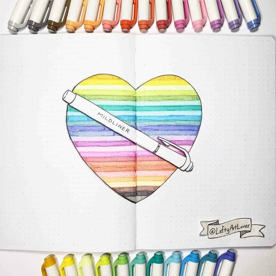
I know I've already had so many swatches for Zebra Mildliners, but this one is so beautiful that I had to include it as well.
I like how all the colors are represented so well, but there are also doodly elements in the actual pen drawing.
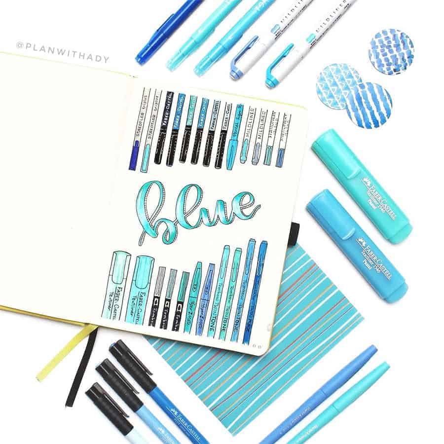
Another excellent idea is to do a pen swatch by color.
I also love how all pens are actually doodled. So much detail and an excellent visual representation of all the pens.
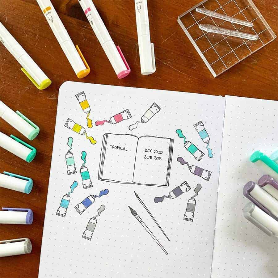
Just because it's a pen doesn't mean you can't play it off as a set of paints on your pen swatch. I like that there is a little journal with the names on the color sets.
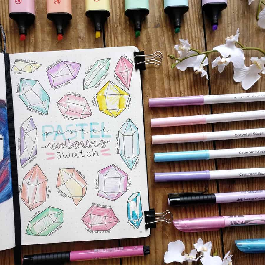
Another fun way is to divide your colors by type like here it's pastel colors.
It's a fun idea to do it in crystals since it's a pretty easy doodle to do, and there are so many variations.
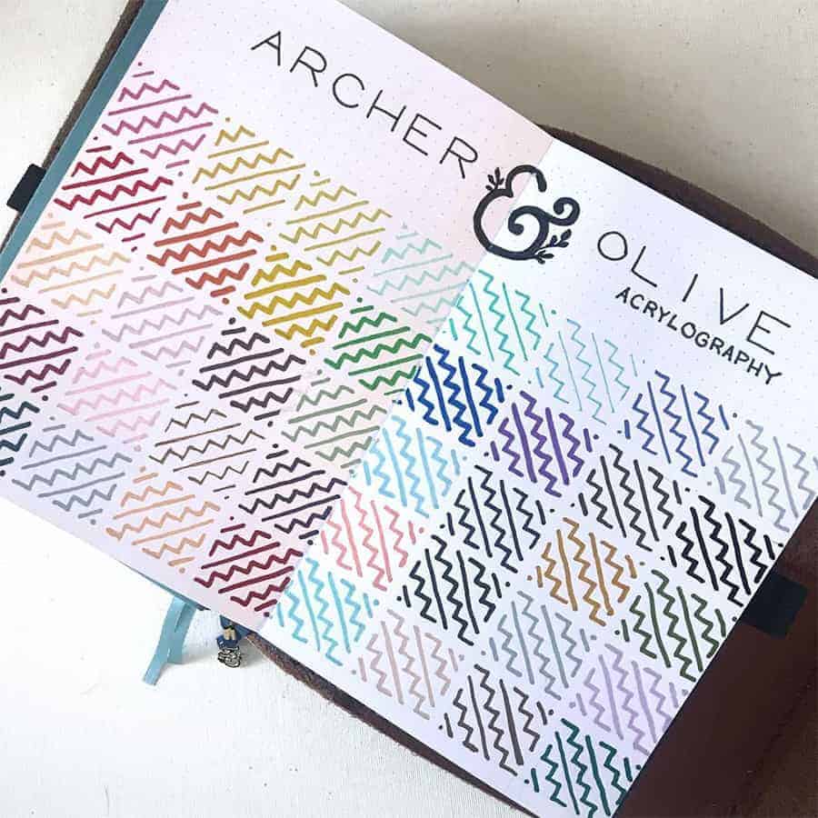
Great swatch of acrylograph pens.
I love all those patterns, and I think it's a great way to make a swatch fun and creative, but also pretty simple.

I love this super fun swatch of these absolutely adorable Stabilo Highlighters. I like that there are swatches of the colors and the colors together, so you can see how well they match.
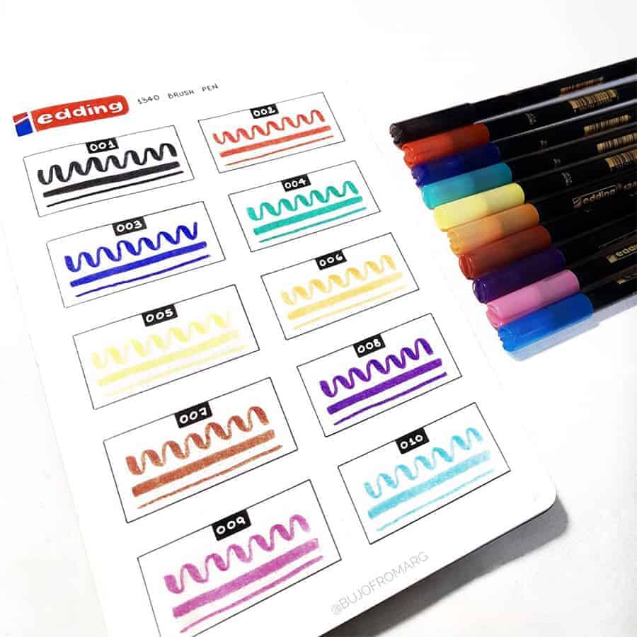
Beautiful swatch page with all the information you need for your brush pen.
I like that there is a stark contrast between the thick and thin lines you can get from these brush pens.
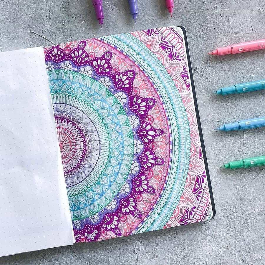
What an incredible idea to make a swatch page like a mandala. Just creating this layout is so calming and enjoyable.
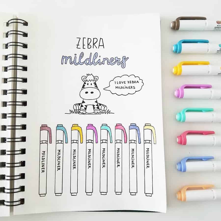
One more Zebra Mildliner swatch; it's so cute I just had to include it.
And it's this zebra up top, just so adorable!
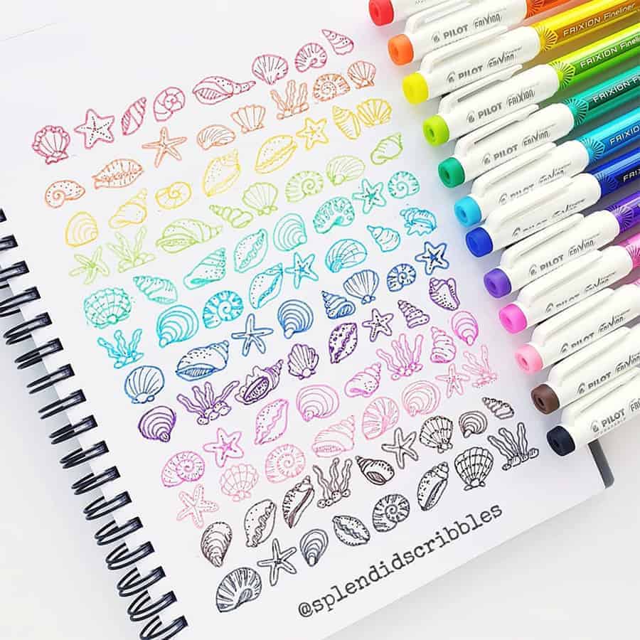
Pilot Flixion are beautiful pens, and I love that they are erasable. Also, this is such a cute idea to do a pen swatch in tiny cute doodles.
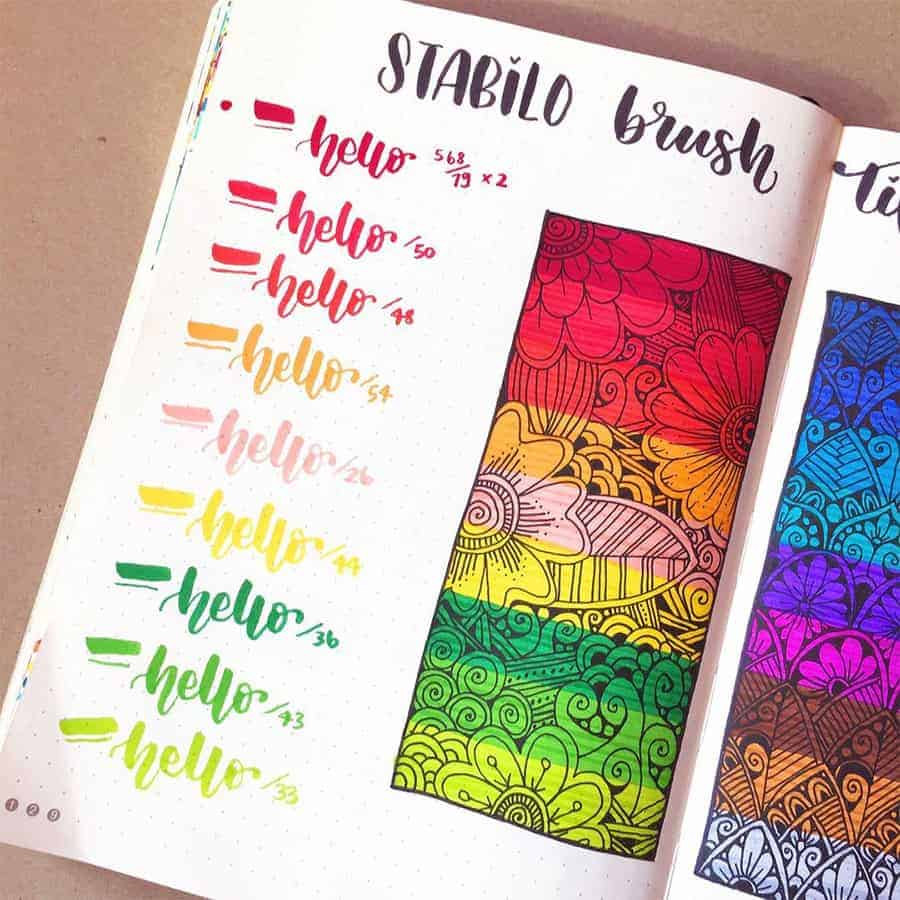
I don't have these pens, but now I want them with how beautiful and bright the colors are. The colors also stand out even more with the black of the doodles.
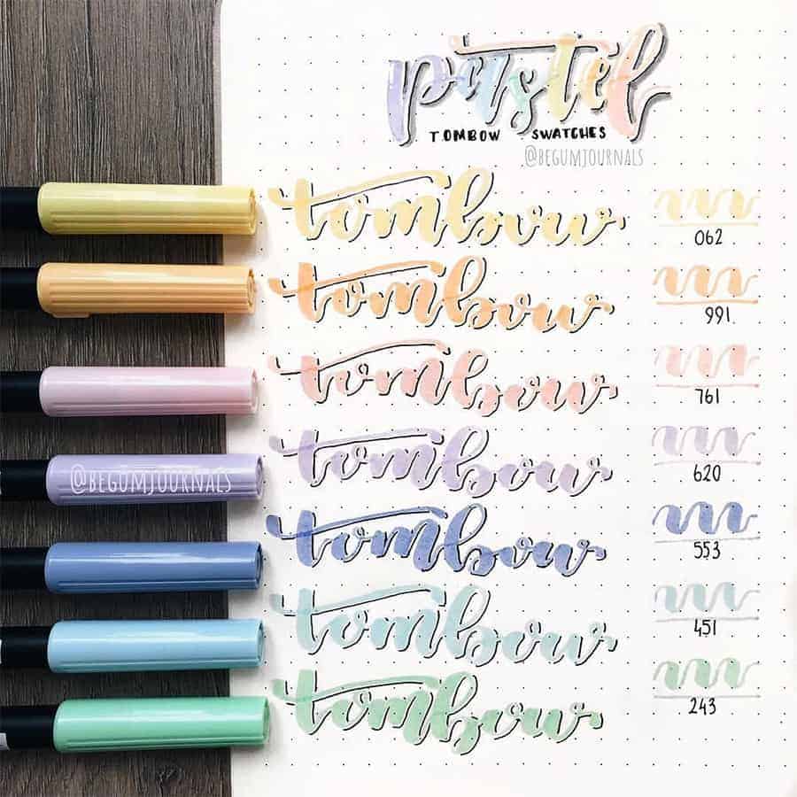
A good idea for a swatch for brush pens is to write something with that pen.
That way, you can get a better idea of the size of the brush and the lettering you can do with it.
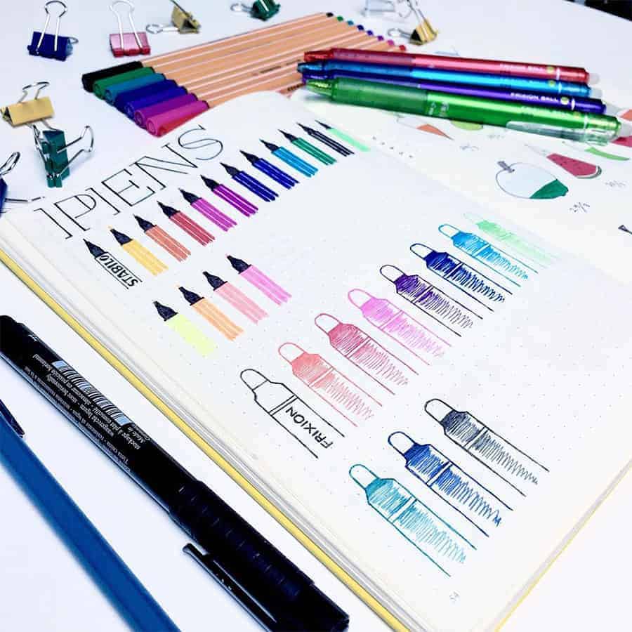
It's such an amusing idea to draw the pens using the pens to show off the colors.
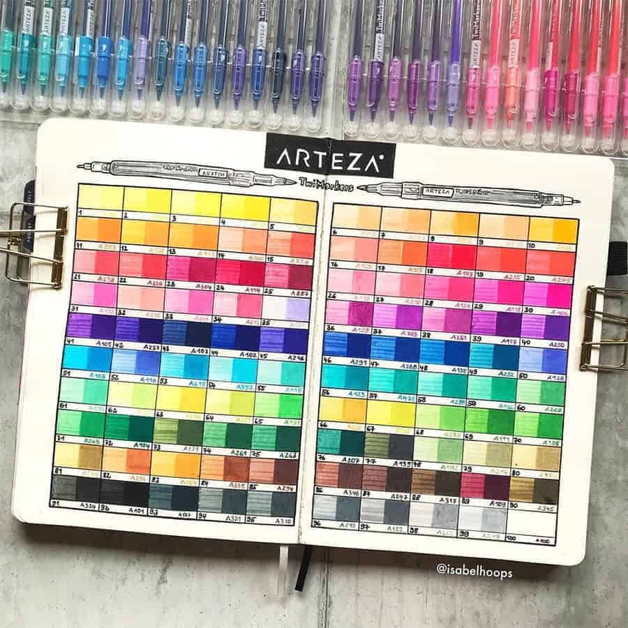
Another unique swatch spread by Isabel Hoops. I specifically love this one because she showed the color would look layered.

If you have a set with too many colors, just little circles like these can be enough.
Of and I definitely recommend this set of Crayola Super Tips, it's very affordable, and you can see it has ALL the colors.
Printable Pen Swatch Pages
If you want to create creative swatch pages but are unsure if you can commit your time and effort to it, I recommend you try printables!
Thankfully, I’ve created a set of printable swatch pages for different types of pens, so you can print and start using them right away.

More Resources
Of course, there are many more ideas and inspirations for different pages you can try in your Bullet Journal.
Check out these posts next:
- Pen Swatch Bullet Journal Page Ideas
- Bullet Journal Washi Tape Swatch Page Ideas
- 13 Inventive Bullet Journal Layouts
>>> Do you do swatch pages in your Bullet Journal? What’s your favorite kind? Let us know in the comments!
Hope this post was interesting. If you find it so, please share! If you enjoy my content and want to show your appreciation, please consider supporting me with a cup of coffee.
And remember: Keep Journaling, and Don’t Be A Blob!
