11 Creative Bullet Journaling Fonts To Try
Diving into Bullet Journal lettering can transform your journal from just a scheduling tool to a canvas of personal expression and creativity.
Remember the last time you flipped through your Bullet Journal, feeling that buzz of excitement at a blank page? That’s the magic waiting to be unlocked with the right Bullet Journaling fonts.
Whether your style is sleek and sophisticated or whimsically playful, the fonts you choose can elevate your journaling experience, making each entry not just a record, but a piece of art.
This post is your treasure map to the most creative fonts out there, designed to inspire your next Bullet Journal masterpiece. Get ready to infuse personality, mood, and a touch of whimsy into your Bullet Journal with these unforgettable font ideas.

Different fonts are like the secret sauce that adds pizzazz to your Bullet Journal pages. Imagine flipping to a new page and seeing a header that pops or a quote that dances across the paper in a font so lively it practically winks at you.
That’s the power of creative font use in your journal. Not only do these artistic choices make your Bullet Journal more fun and bright, but they also turn everyday entries into something uniquely yours.
And don’t get me started on the endless possibilities for theme pages. Whether you’re planning a summer holiday, tracking your reading list, or jotting down your fitness goals, there’s a font that can add an extra layer of joy and creativity to your endeavor.
From sleek and modern to whimsical and hand-drawn, choosing the right font can truly transform your Bullet Journal into a vibrant, engaging diary of your life’s adventures.
Remember, your Bullet Journal is not just a planner; it’s a playground for your creativity. So, go ahead, mix things up with different fonts, and watch your pages come alive with personality and charm.
Oh, and if you’re looking for something special to add creativity to your Bullet Journal pages, be sure to scroll until the end and get some FREEBIES that will make your pages pop!
This post may contain affiliate links. They will be of no extra expense for you, but I receive a small credit. Please see my Disclosure for more details. Thank you for supporting Masha Plans!
Stationery Recommendations
There are so many supplies to choose from, and I’m sure you want to pick the ones you’ll love using the most.
So here are a few of my favorites, especially for creating different fonts:
- Sakura Pigma Micron – these are some of the best fineliners, perfect for creating all types of elements in your Bullet Journal. Their black archival ink will make all your headers look sharp.
- Tombow Fude Brush Pens – my favorite small tip brush pens will allow you to create the most intricate headers, especially with smaller elements. Plus, of course, you can use them for brush lettering.
- Crayola Super Tips – these are some of the best markers out there, since they come in so many colors and are pretty affordable.
- Tombow Dual Brush Pens -if you’re looking for something extra, these brush pens are it! They have tons of colors and double tips, so you can use a brush tip for lettering and a marker tip for adding smaller elements.
Now, with supplies ready, let’s get into some fun fonts you can use for your headers!
11 Bullet Journaling Font Ideas
Just because fonts look like they’ve been spun from the dreams of graphic designers, it doesn’t mean you need an art degree to bring them to life in your own Bullet Journal.
Honestly, even if the last time you felt creative was when you mixed two cereals together (and hey, that was a culinary masterpiece), you’ve got this. Replicating most of these fonts is way easier than you think, and I’m here to guide you through it, step by playful step.
Now, don’t get me wrong—seeing all those fancy fonts might have you thinking, “Surely, I can’t do that.” But trust me, with a little patience and practice, you’ll be whipping up headers and quotes that could make a typographer do a double-take.
So, grab your favorite pen, and let’s plunge into the fun world of Bullet Journal fonts together. You’re about to discover just how simple and satisfying adding a touch of typographic flair to your pages can be!
Floral Font
Kicking things off with a floral font is like inviting a garden party onto your Bullet Journal pages – it’s super cute and effortlessly adds a touch of floral decoration.
You can keep it as minimalist as a single daisy on a sunny day or go all out and turn entire words into a bustling bouquet of blooms.
Here’s the beauty of using floral fonts: there’s no right or wrong way to do it. Whether you’re someone who appreciates the elegance of simplicity or someone who loves to lavish your pages with intricate floral patterns, it’s all about making it your own.
And the best part? You don’t need to be a Van Gogh to create something beautiful. A few petals here, a couple of leaves there, and voilà, you’ve turned your journal into a canvas of botanical art.
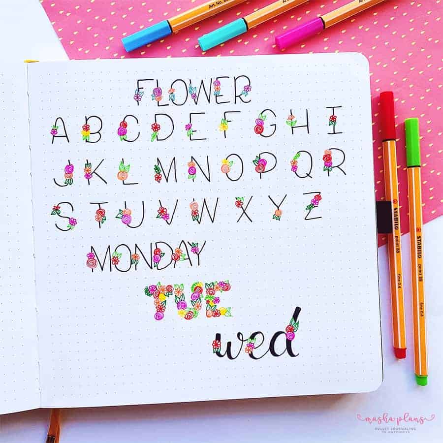
All you need to make this font come alive is to sketch the letters and floral doodles in pencil, and then use your favorite pens, be it colorful ones for contrast like I did or just black for an aesthetic monochrome look.
Whatever flowers and colors you choose, just know that adding a floral font is like giving yourself a bouquet of flowers that will never wilt – a permanent reminder of the beauty you can create with just a pen and a little imagination.
90s Bullet Journal Font
Ah, the 90s! Picture it now: a riot of neon shades, the air filled with the beat of dance anthems, and fashion statements bold enough to stop traffic. That decade really had a way of sticking with you, like a catchy tune that never quite leaves your head.
And now, we’re about to sprinkle a bit of that 90s sparkle onto your Bullet Journal pages with a font that’s all kinds of cheerful.
Really, who could resist a splash of 90s flair in their journal? It’s not just about adding a pop of color or a nostalgic vibe; this font is like the cool, retro gadget you unearthed at the back of a drawer, full of memories and ready to make new ones.
Perfect for channeling those back-to-school vibes, it’s the equivalent of the coolest backpack on the first day of class – vibrant, functional, and bound to bring a grin to your face.
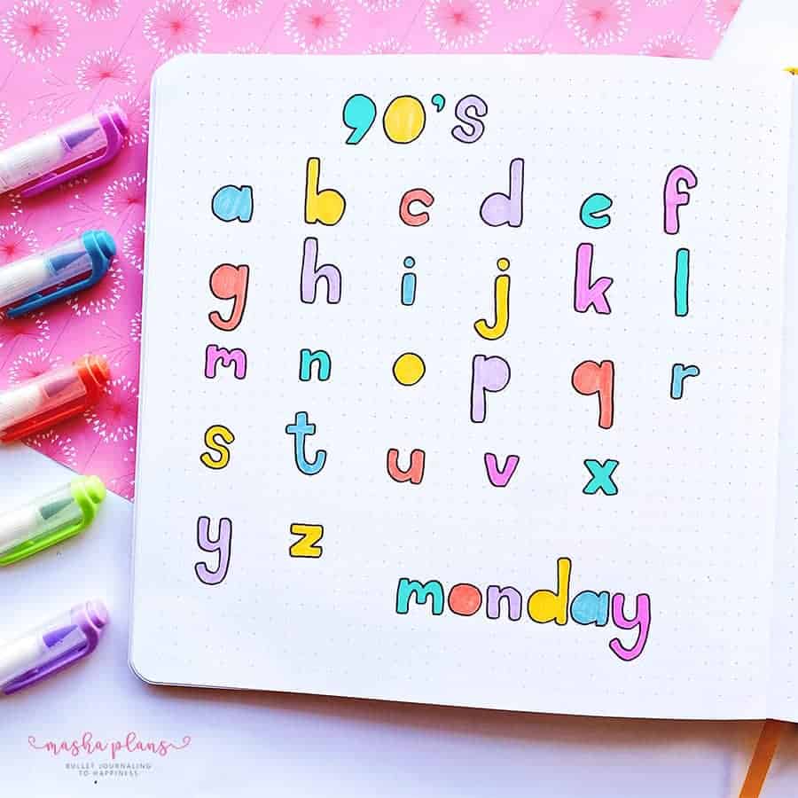
Here’s the skinny on crafting this font: start with those chunky block letters we all doodled in our notebooks back in the day. Then, round off the edges like you’re smoothing out the rough parts of a good memory, and hollow out any circles for a touch of whimsy.
There you have it – a font that’s not only a breeze to whip up but also brimming with the feel-good vibes of the 90s.
Stitch Font
I’ve got to admit, coming up with names for fonts is not exactly my superpower – I’m more of a “create first, name later” kind of person. But hey, I’m thrilled to share this latest creation with you!
Picture this: you’ve got your classic block letters, right? Now, imagine giving them a little bit of flair by sketching tiny lines bursting out from the edges – like each letter just can’t contain its excitement. To kick things up a notch, I went ahead and brushed a light shade of grey across them, then added a playful shadow to bring it all to life.
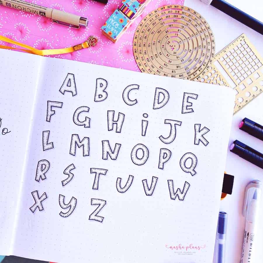
The result? A font that’s as fun and quirky as a surprise costume party. It’s got that perfect vibe for Halloween-themed pages, making your Bullet Journal the star of October.
Whether you’re jotting down your spooky movie marathon list or tracking which candies you need to stock up on (because who wants to be that house?), this font will add just the right touch of whimsy.
Cursive Shadow Font
Oh, have I got a treat for you! There’s this font that’s stolen my heart—it’s got that cozy, laid-back vibe of brush lettering. Honestly, it’s like the comfort food of fonts for me.
Here’s how you can get in on this little slice of joy. Grab two colors from your palette that are pretty close to each other, one just a tad darker than the other. Now, with the darker shade, start writing in cursive. It’s like sending a love letter to yourself, really. Then, take the lighter color and gently add a bit of shadow to those letters.
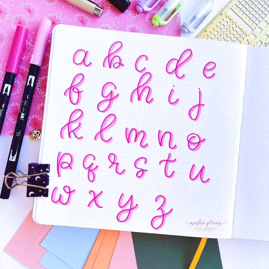
The result? It’s a font that looks like you spent hours on it when, really, it was just a few fun, creative moments. This technique is perfect for adding a personal touch to your Bullet Journal, making your pages look effortlessly beautiful.
And yes, only now I’m realising that the letter “v” is missing. But that’s what happens when you’re drawing letters rather than writing them – too lost in the creative process!
Bubble Font
Oh, bubble fonts! They remind me of those carefree days doodling in the margins of my notebook. Here’s a little secret on how to bring that bubbly joy into your Bullet Journal.
First off, just jot down your letter in the good old-fashioned way. Now, imagine each letter is living its best life, puffing up like it’s about to float away – that’s right, sketch a bigger, bolder version around it.
Now, here comes the twist – instead of making your bubble uniform, give it a bit of character! Puff it up more on one side and keep it snug on the other. It’s like your letters are leaning into a gentle breeze.
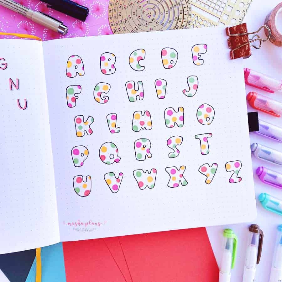
I’ll be honest, the coloring phase had me second-guessing my choices. But hey, that’s the beauty of Bullet Journaling – it’s all about experimenting and finding what sparks joy for you.
Feel free to take this bubbly concept and run with it. Splash on your favorite colors, add some glitter, or maybe some shadow effects? The sky’s the limit.
Easy Fonts To Write: Serif
Ah, the quest for that go-to font! You know, the one that looks like you’ve poured your heart and soul into each letter, but between us, it’s our little secret that it’s as easy as pie.
I’ve got a trusty sidekick in my Bullet Journal adventures for just this purpose. When my pages need a dash of pizzazz without making me break into a sweat, I turn to this little gem.
Here’s a fun trick to jazz up those straightforward letters: add serifs. It’s like putting a fancy hat on an otherwise casual outfit. Suddenly, what was just your standard print dresses up, ready to impress, with hardly any extra effort. It’s the classic look we all know and love, but with a twist that says, “Yeah, I’m interesting.”
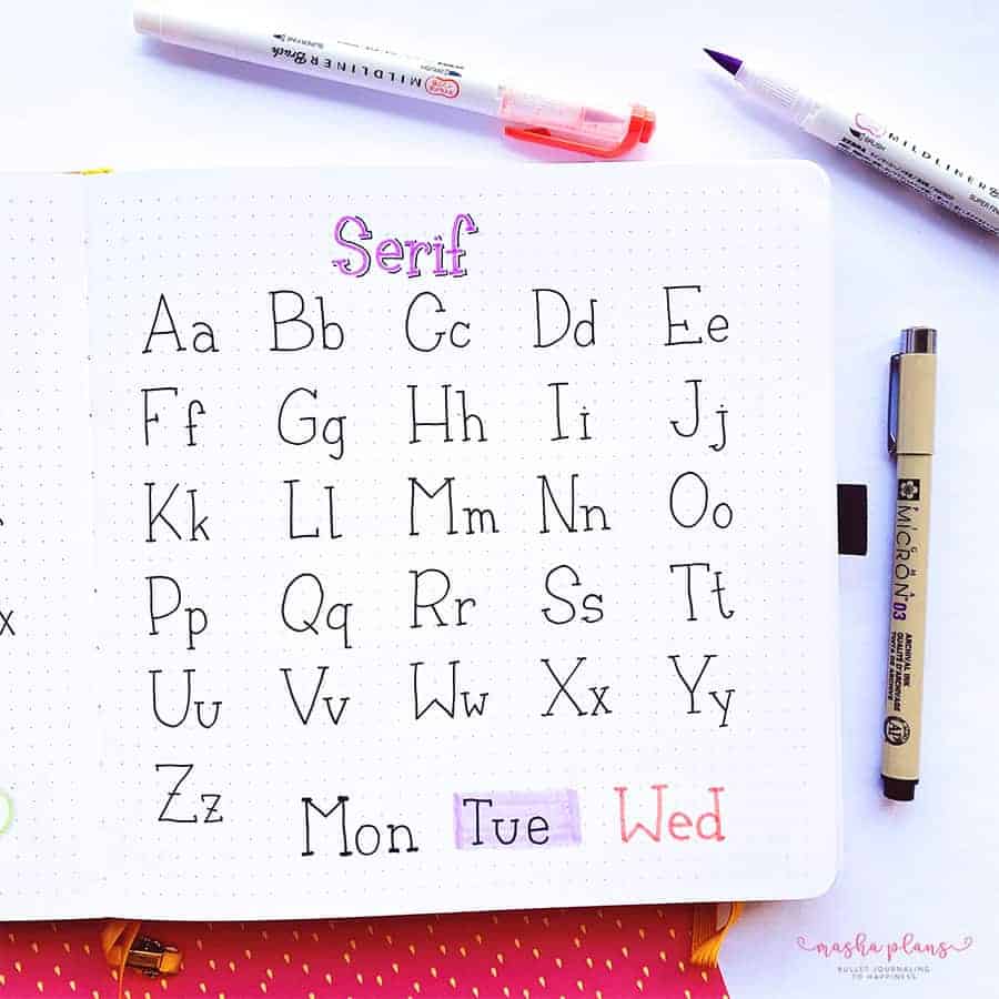
And don’t even get me started on customization! Just like choosing the right accessories for your outfit, adding a splash of color, some shadows, or even using a color backdrop can make your text pop off the page. It’s like giving your letters their own little personalities.
3D Bullet Journal Font
Oh, get ready for a font adventure that’s slightly more of a trek than a leisurely stroll in the park, but oh, is it worth the extra steps!
This one’s not for the faint-hearted—or should I say, faint-handed? You see, the letters end up on the larger side of life, meaning those tiny headers might have to sit this dance out. But don’t you worry, there’s a whole ballroom of opportunities to waltz this beauty into your Bullet Journal pages.
Now, I won’t sugarcoat it; this font does ask for a bit more elbow grease. But here’s a little secret between you and me: sketching these out is almost like a mini-vacation for your brain. There’s something almost magical about the process—like knitting or baking bread from scratch—that’s just so…therapeutic. It’s you, your pen, and endless possibilities.
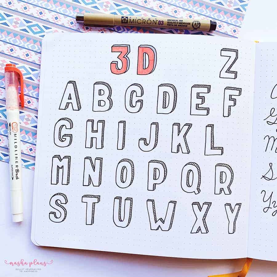
Here’s the grand reveal on how to bring this 3D wonder to life: Start with drawing your block letter, nice and solid. Next, summon your inner artist to draw a shadow twin of that letter, just a tad off to the side. Connect the dots—well, actually, the letters—in this case, and bam! You’ve got yourself a letter that practically leaps off the page.
Curved Font
Have I stumbled upon a delightful little font secret that’s as easy as pie to whip up? Absolutely, and I’m just bursting to share it with all of you fellow Bullet Journal enthusiasts!
Picture this: your good old simple print font. Now, give those letters a little wiggle, adding curves to the ends. It’s like they’re stretching after a long nap, ready to add some pep to your pages.
But wait, there’s more! To really make these letters sing and dance off your journal, grab a marker and go to town writing them out. Then, with the precision of a cat stalking its prey, take a black pen and outline those colorful characters. It’s a simple trick that brings a whole new level of depth and vibrancy to your pages.
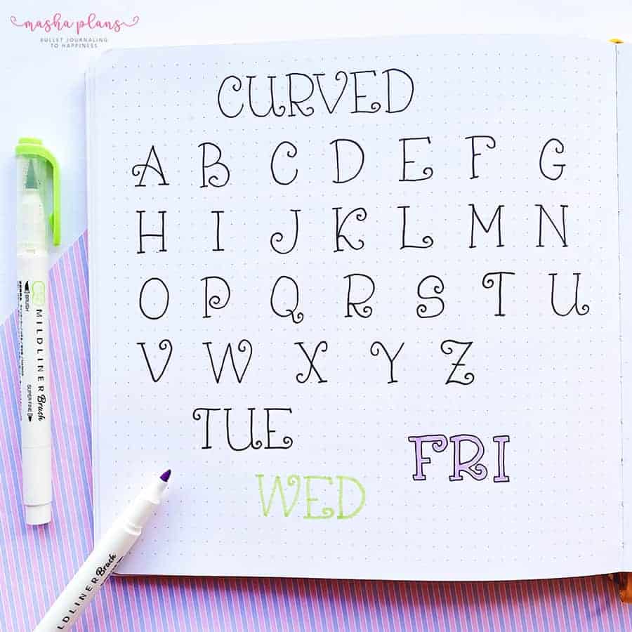
This method is my absolute go-to when my Bullet Journal needs a dash of flair without turning into an overnight art project. It’s fun, it’s quick, and the results are nothing short of charming.
Plus, there’s something about the process that feels like reconnecting with an old friend—comfortable, familiar, but always able to surprise you.
Offset Bullet Journal Font
Oh, buckle up, my Bullet Journaling buddies, because I have come up with a font that is as forgiving as your best friend after you’ve accidentally spilled the beans about their surprise party.
The kind of font that not only embraces imperfections but practically throws a welcome party for them. And you know what? It’s an absolute blast to create!
Here’s the scoop: grab your favorite colored marker and just go to town jotting down a letter. Then, with a black pen, trace around that letter, but here’s the kicker—do it a bit off to the side. Imagine you’re drawing a shadow that decided to go rogue and live its own life.
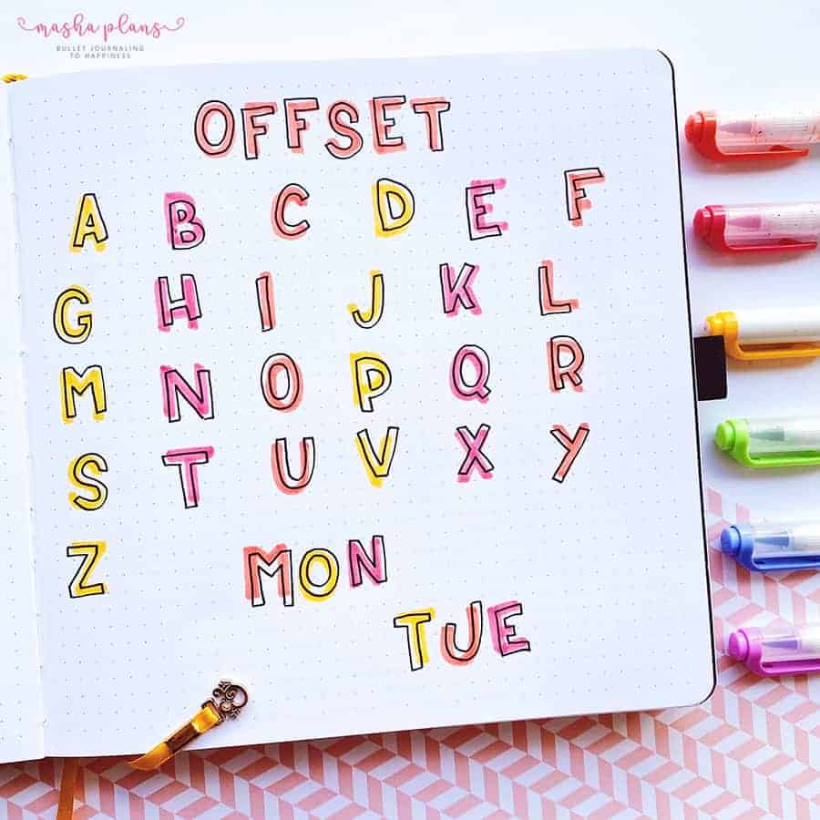
Now, if you’re anything like me and the thought of “perfection” in your Bullet Journal sends you into a mild panic, this font is going to be your new best friend.
Why? Because those letters you’re jotting down? They don’t have to be flawless. Not even close. The beauty of this font lies in its quirks and wobbles. It’s like each letter has its own little personality, complete with all the charming eccentricities.
In a world where we’re often chasing the illusion of perfection, this approach to font creation in our Bullet Journals is a breath of fresh air. It’s a gentle reminder that it’s okay to step outside the lines—literally and metaphorically.
Dotted Bullet Journal Font
Alright, friends, gather round because I’m about to spill the beans on a Bullet Journal technique that’s a bit like a marathon of patience—but boy, does it cross the finish line with style. We’re talking about the stippling effect. Yes, it’s the tortoise in the race against time, but when you see the results, you’ll be reaching for your pen instead of the snooze button.
Imagine sitting down with your favorite playlist humming in the background, armed with nothing but a pencil and a sea of dots waiting to be born. You start with sketching out your letter—go big and bold, because this technique is all about making a statement.
Now, here comes the zen part: dot by dot, you begin to breathe life into your letter. It’s like dot-to-dot for grown-ups, but way cooler. You keep dotting around the edges of your penciled guide, letting the dots wander off like little explorers into the whitespace of your page. The trick? Play it cool with the dots—less is more as they venture further from your letter.
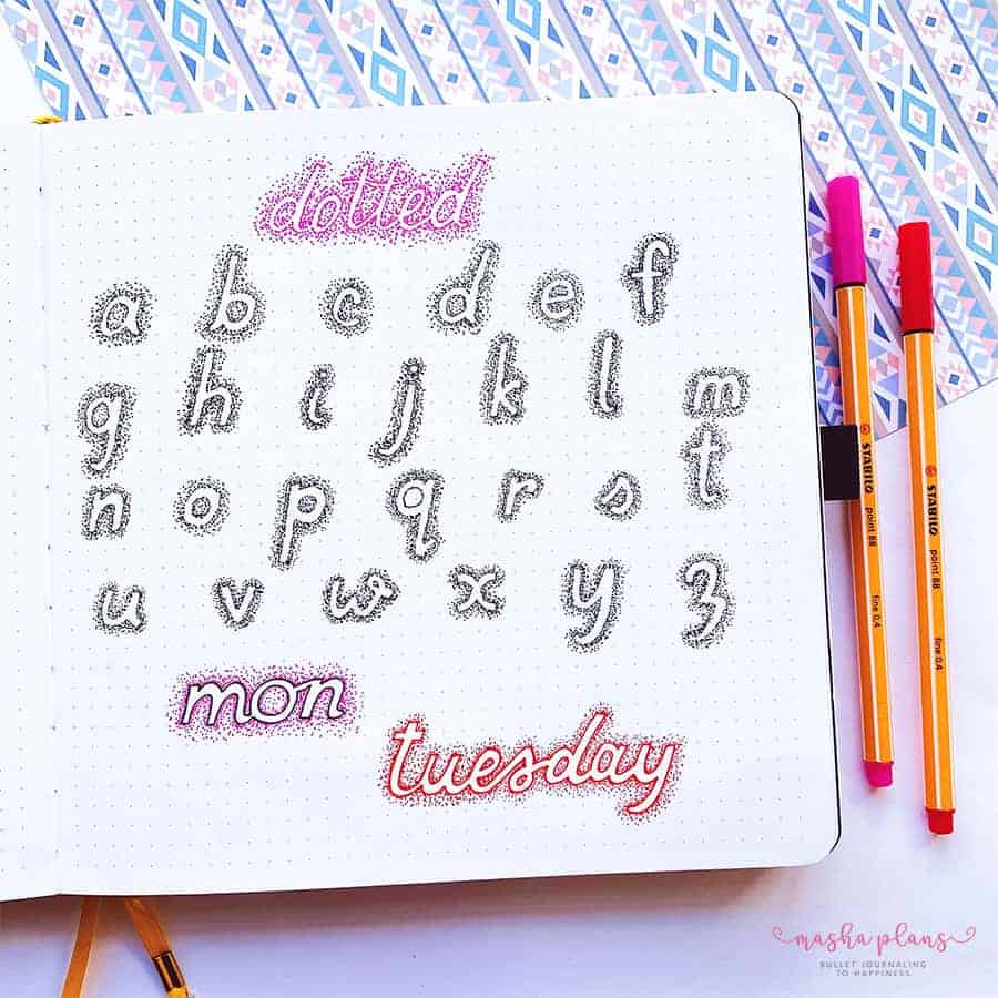
And just when you think you’ve got the hang of it, I’m throwing in a curveball. Another way to rock this look is by outlining your letter first and then letting your dots follow the leader. This little twist helps your letters to pop like popcorn on movie night—visible, bold, and impossible to ignore.
Sure, it’s a process that asks you to slow down and maybe even question your life choices as you dot your way to glory. But trust me, the result is a page that looks like a million bucks (or at least like you spent a million dots on it). Plus, there’s something strangely satisfying about seeing it all come together, like watching a plant grow from a seed you planted yourself.
Faux Calligraphy
Brush lettering is like that cool party trick everyone wants to master, but boy, does it take some practice. But what if I told you there’s a backstage pass to achieving that gorgeous calligraphy look without having to spend hours with ink-stained fingers? Welcome to the world of faux calligraphy, my friend!
Here’s how it goes down: first, you jot down your words in your usual handwriting. No pressure—it doesn’t have to be perfect. Then, with a flick of your pen, you go back and add a little oomph to those downstrokes, thickening them up as if a brush pen magically took over. It’s like giving your letters a mini makeover, turning them from plain Janes into glamorous divas.
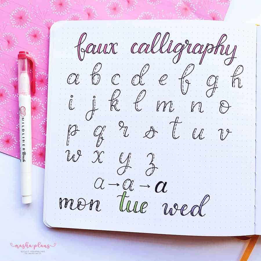
Now, here’s where you can really crank up the fun dial. Those thick parts of your letters? Think of them as blank canvases waiting for your creative touch.
Grab some colored pens, a handful of glitter, or even some watercolors, and start experimenting. Patterns, gradients, shadows—you name it. It’s like dress-up for your journal.
Creativity Freebies
Looking for more ways to add creativity and color to your Bullet Journal pages? I’ve got you covered with these exclusive 3 freebies that will level up your Bullet Journal pages in no time.
Plus, you’ll get tons more resources and ideas delivered straight to your inbox.
Sign up on the form below, and once you confirm your subscription, all the goodies will be on the way to your inbox.
More Resources
Of course, when we talk about adding creativity to your Bullet Journal pages, there is so much more to share!
So here are a few more blog posts for you to check out next:
- 23 Bullet Journal Fonts You Need To Try Today
- 5 Easy Handwriting Fonts You’ll Love
- Free Online Brush Lettering Courses
>>> Which of these fonts will you be using in your Bullet Journal? Share with us in the comments!
Hope this post was interesting. If you find it so, please share! If you enjoy my content and want to show your appreciation, please consider supporting me with a cup of coffee.
And remember: Keep Journaling, and Don’t Be A Blob!





I love all the cute fonts you do!
Thank you! Happy you enjoyed these ideas =)