23 Bullet Journal Fonts You Need To Try Today
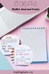
Bullet Journal lettering is a fun and creative way to add personality to your pages, even if you’re just starting out. With just a pen and a notebook, you can create something uniquely yours.
While simplicity is a great starting point, there’s always room to explore more creative options. Experimenting with font ideas can make your journal stand out and reflect your personal style.
If that sounds like something you’d enjoy, you’re in the right place.
Today, we’ll dive into some exciting Bullet Journal fonts that can bring your pages to life and make your setups even more enjoyable!
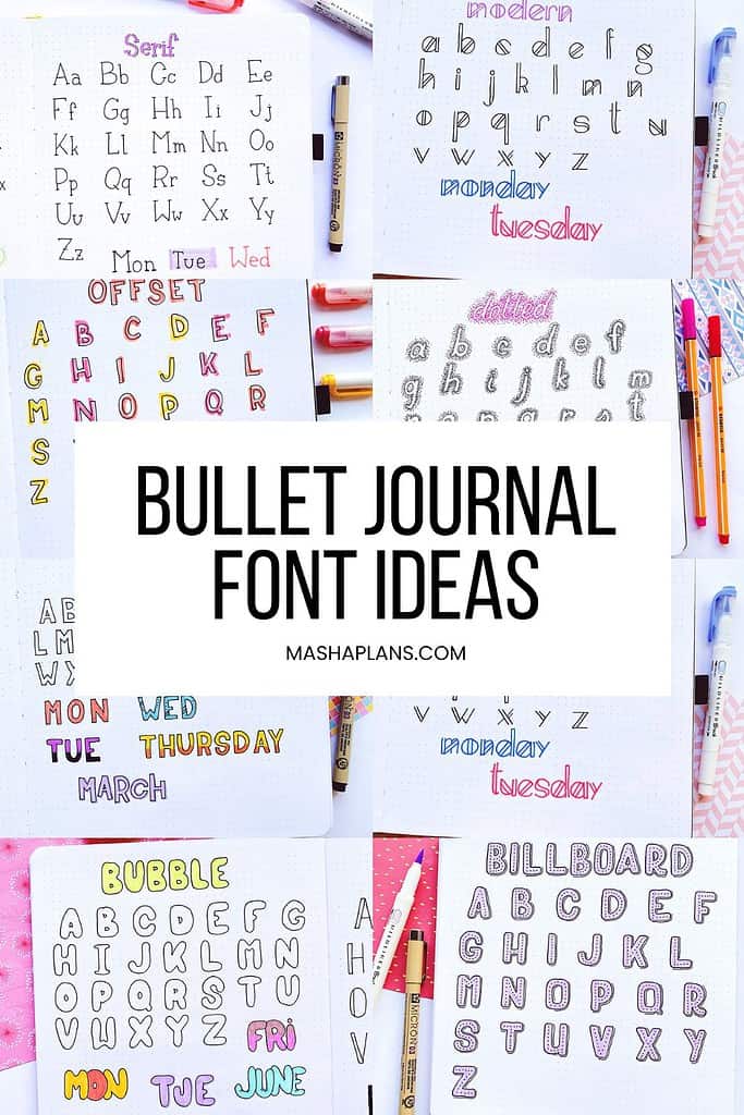
There are many ways to add some more creativity to your pages. Among some of my favorite ones are stickers, washi, and stamps!
But those require you to make a purchase, while fonts just need you to use the same old pen you’ve been using so far.
Below are 23 beginner-friendly fonts, and I hope you’ll have lots of fun using them in your journal.
And be sure to scroll until the end to get some FREEBIES to help you be more creative and add color and spark to your Bullet Journal pages.
This post may contain affiliate links. They will be of no extra expense for you, but I receive a small credit. Please see my Disclosure for more details. Thank you for supporting Masha Plans!
Stationery Recommendations
There are so many supplies to choose from, and I’m sure you want to pick the ones you’ll love using the most.
So here are a few of my favorites, especially for creating different fonts:
- Sakura Pigma Micron – these are some of the best fineliners, perfect for creating all types of elements in your Bullet Journal. Their black archival ink will make all your headers look sharp.
- Tombow Fude Brush Pens – my favorite small tip brush pens will allow you to create the most intricate headers, especially with smaller elements. Plus, of course, you can use them for brush lettering.
- Crayola Super Tips – these are some of the best markers out there, since they come in so many colors and are pretty affordable.
- Tombow Dual Brush Pens -if you’re looking for something extra, these brush pens are it! They have tons of colors and double tips, so you can use a brush tip for lettering and a marker tip for adding smaller elements.
Hand Lettering Tips
Decorating your Bullet Journal pages with different fonts might sound like a hard thing to do. I know when I started, I didn’t think I had it in me to actually make these look cute.
But the truth is – everyone can do it! So here are a few of my tips that will help you avoid some silly mistakes when you start.
- Practice is everything! You can pretty much master anything if you practice enough, including the most elaborate fonts.
- Use a pencil first. You probably know by now that I always use a pencil first. This allows you to avoid mistakes and perfect your font before making it permanent with a pen.
- Try tracing. This is a good trick if you’re still doubting your calligraphy skills – just print it out in the font you want and trace it.
- Use the dot grid to guide your writing. It can help you keep it straight.
- Get a good pen. A smooth writing pen is always helpful when you experiment with your fonts.
Bullet Journal Fonts
I created 23 different font ideas for you to use in your Bullet Journal.
For each font, I created a complete alphabet, and I’ll be sure to explain any tricky elements.
Simple Print Font
Well, of course, start with the simplest font.
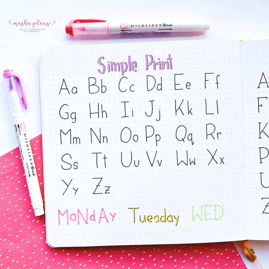
No wonder this is the one they teach kids at school. It consists of some very simple lines and is very doable even if you’re not that good with your writing yet.
If you want to add some more fun to this simple font, you can use color, add shapes, and play with the size of your letters.
Easy Fonts To Write: Serif
Want to add some interest to your simple print? The solution is just to add a serif to your letters.
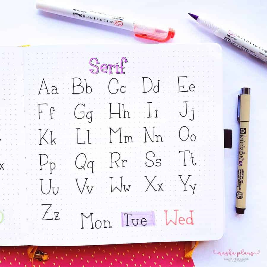
Just like with the simple print, you can add some more character to your letters if you use colors, add shades, or maybe just add color as a background for your text.
Skinny Caps and Quirky Bullet Journal Fonts
These two fonts came out looking pretty similar, so I decided to combine them into one.
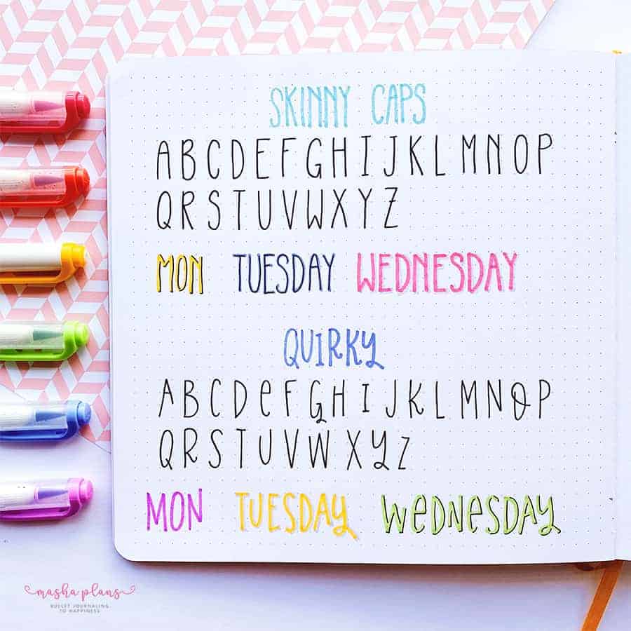
Skinny caps are just your usual simple print, but stretched a bit vertically. I like using it for headers and other titles.
The quirky font is very similar; I just tried to make it a bit more fun by playing around with the size of the letters and adding some curves.
Block Letters
Block letters might look difficult, but they are much easier to draw than you think.
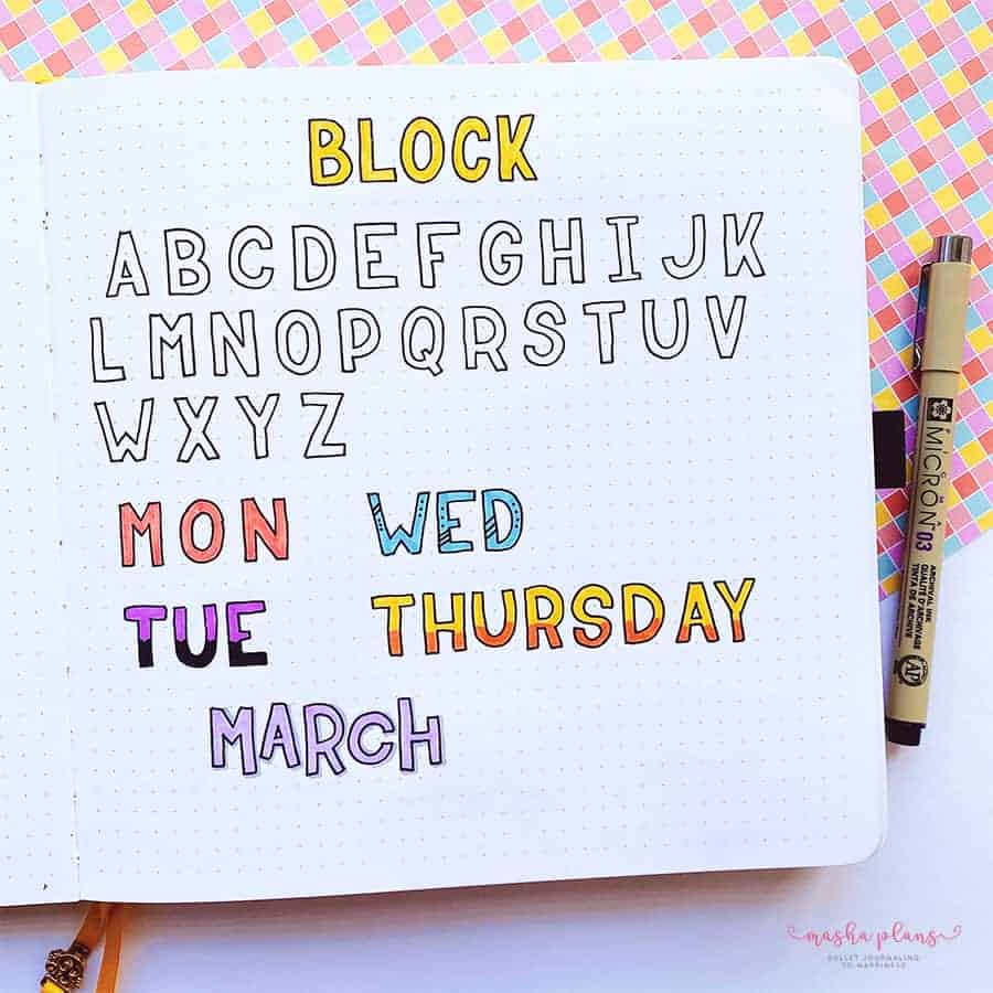
Drawing block letters is all about connecting straight lines. The secret is just to make sure you use the same-sized area for all your letters.
If you are using a dot-grid journal, the grid will help you so much to make sure all your letters are straight.
I also really like block letters because you can do so much with the inside of the letters – play with colors and patterns.
Font Ideas: Half Block
If creating a complete block letter seems too daunting for you, you can try doing a half-block instead.
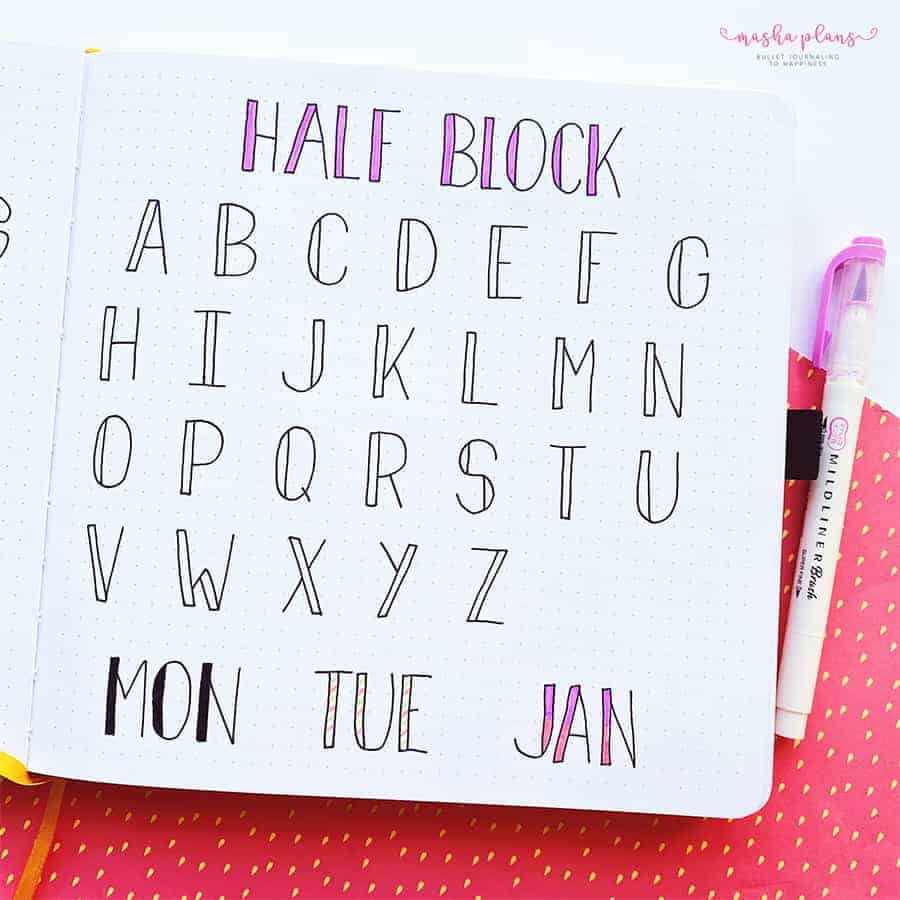
The great thing is that these are easier to draw, but you still get to have fun with adding colors and patterns in the block parts.
Bubble Font
This one is super fun, especially for summer themes!
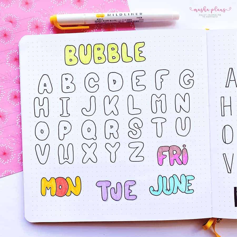
At its core, it’s basically block letters but with rounded corners. The fun part about bubble letters is that you don’t have to be precise; they can get curvy and crazy, and it usually looks really cute.
3D Font
This is a bit more difficult, but it’s worth it!
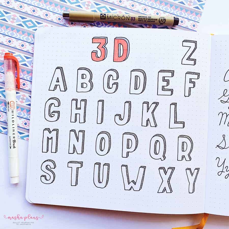
Drawing those is kind of therapeutic, and even though it takes a bit of effort, it can look so very interesting.
Basically, you draw your block letter; then you draw another block letter but a little bit offset. Connect your two letters, and you’ll get a perfect 3D letter.
Cursive Font
Your basic cursive can look just as awesome in your journal as any other of these fonts.
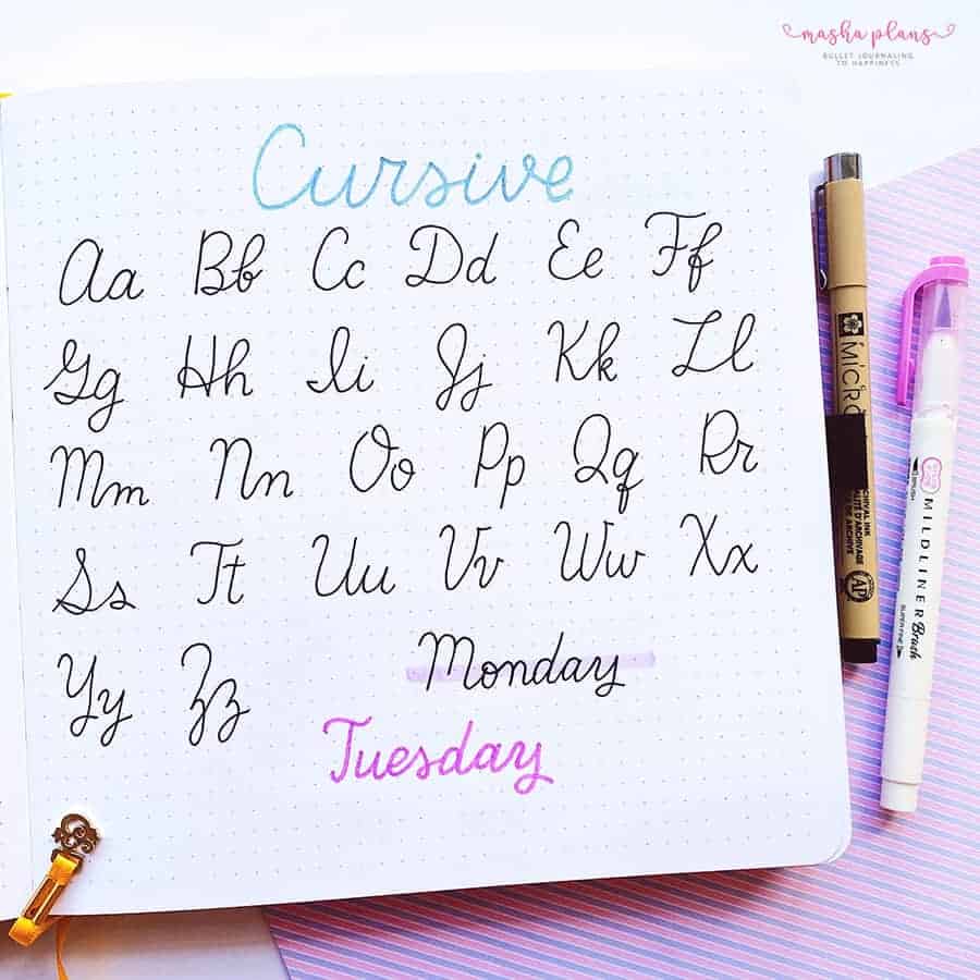
You can use color and different banners to make your cursive stand out.
And if you’re not very confident about your cursive yet – don’t worry. Just keep on practicing, and you’ll see your cursive getting better.
Brush Lettering
This is definitely at the top of my list of favorite fonts to use in my Bullet Journal.
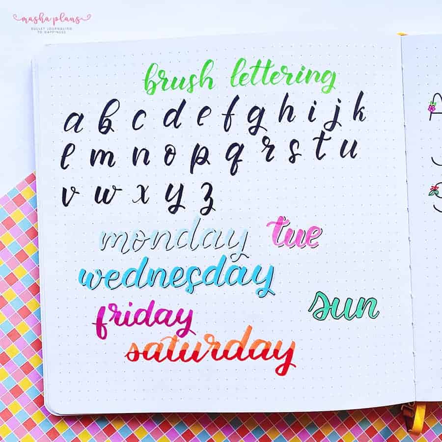
Learning brush lettering takes a while, but it’s absolutely worth it! And if you haven’t mastered that yet, you can always start with faux calligraphy!
Faux Calligraphy
If you want to have a brush lettering effect but haven’t mastered it yet, you can go with faux calligraphy.
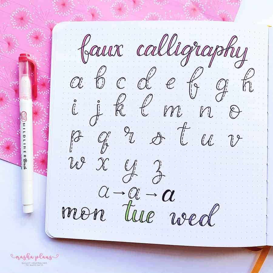
The idea is simple – you just write your words and then add thickness to your downstrokes as if you were using a brush pen.
The fun part about faux calligraphy is that you can play around with the thick part of your letters and use different colors or patterns to decorate them.
Heart Font
Perfect for Valentine’s Day, wouldn’t you agree?
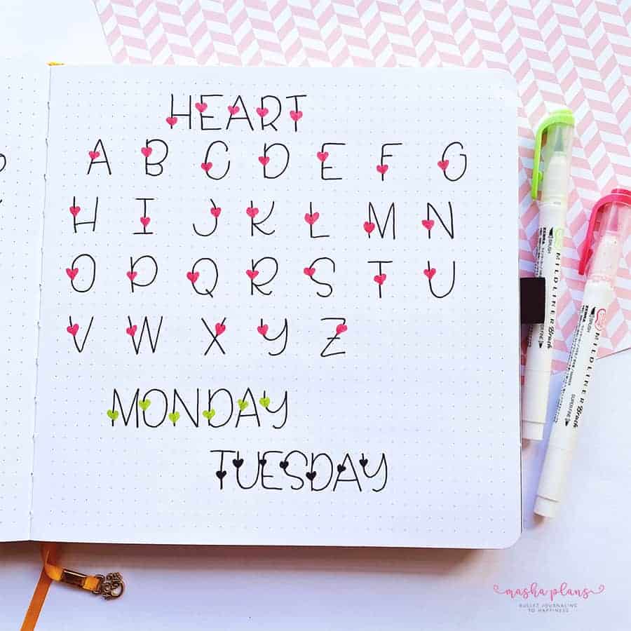
It’s also pretty simple to create this font since the basis of it is a simple print.
That’s how I approached creating this one: start from a pencil sketch of the letters, then use color to add the hearts, then use a pen to draw the letter.
The fun part is that you can play around and use different little doodles, like little stars or maybe clover leaves, for Saint Patrick’s Day.
Journaling Fonts: Floral
Florals are a great theme for your Bullet Journal, and using a floral font can add some more fun to your setup.
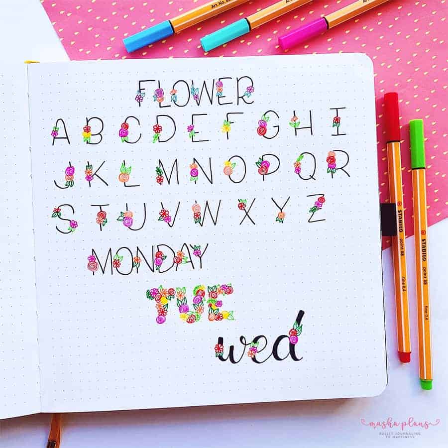
The primary approach is the same as the heart font – start from a pencil sketch of the letters, draw a flower, and then finish up by going over the letters with a pen.
I love that you can also get creative with it. You can create block letters made out of flowers or maybe combine the flowers with some faux calligraphy.
Curved Font
Fun little font and pretty simple to create as well.
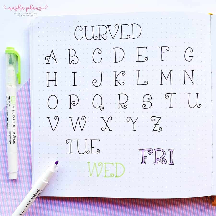
You start with your basic, simple print font, and you add curves to the ends of the letters.
There are many ways to make this pop; my favorite is probably using a marker to write the letters and then outlining them with a black pen.
Modern Font
This modern kind of art deco style is pretty perfect for the 20s, I think.
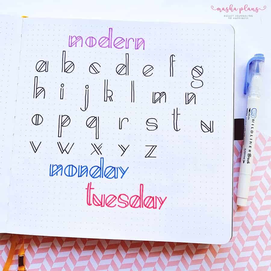
I wrote here the whole alphabet for your convenience.
It’s a very simple font; it consists of basically just straight lines, so it will be pretty easy to make it look perfect if you just use a ruler.
Hollow Font
Here is a font that takes extra effort but looks unique.
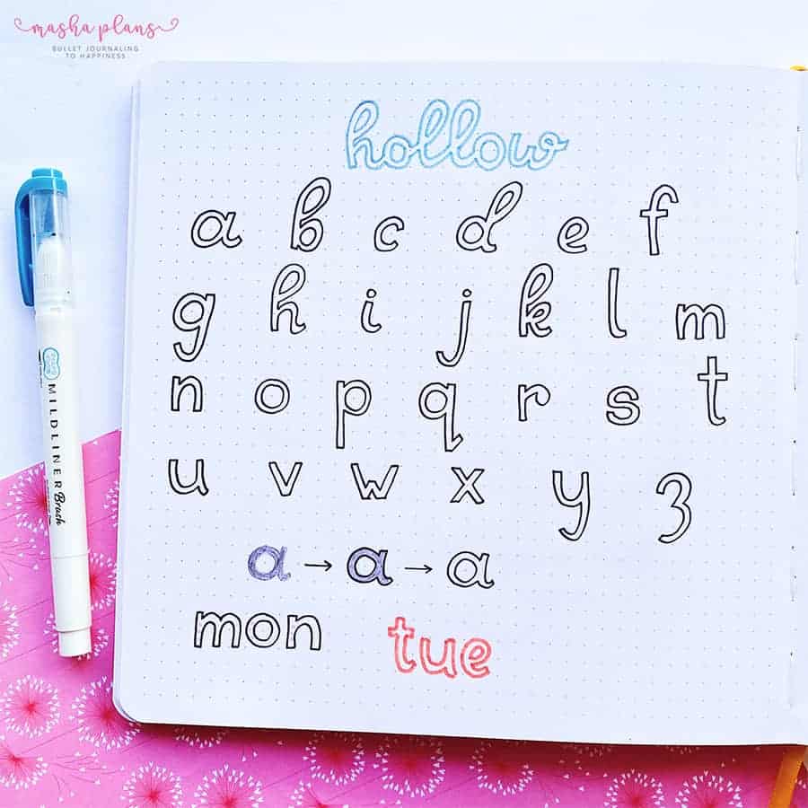
This is how you do it. You start with a thick letter in pencil. After that, you use your black pen or a colored pen to outline the letter.
The final step – erase the pencil.
Square Font
I really didn’t know what to call this font, but since each letter fits in a square, I decided I’ll just name it a square font.
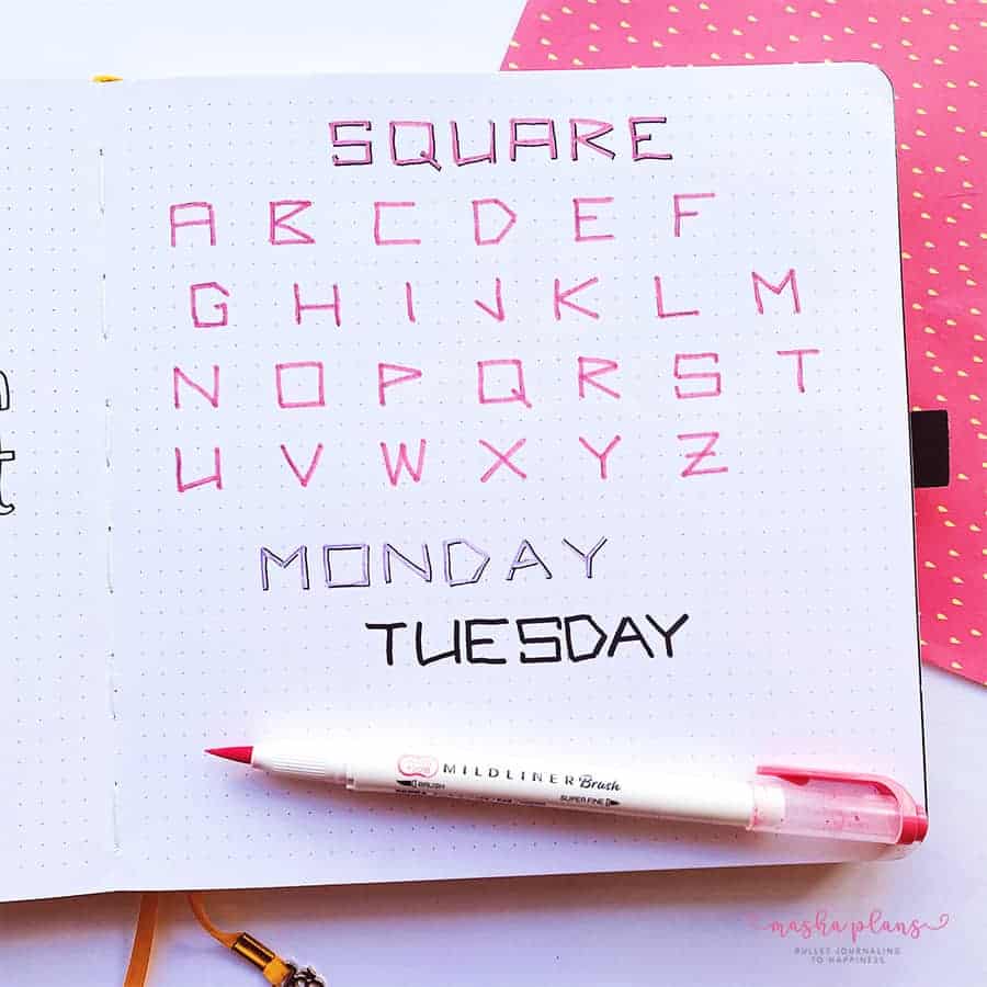
This font is pretty easy; just use the dot grid to guide yourself and keep each letter in its square.
This can be a great phone for a computer theme or something like that. This font makes me think of the ’90s, old games, and maybe Matrix movies.
Arrow Font
Just a few extra lines, and there you go – a whole new font!
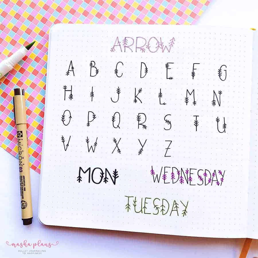
This would be a totally fun font to use if you’re doing a boho theme.
Dotted Font
Ok, this one takes a lot of time, but the stippling effect always looks great.
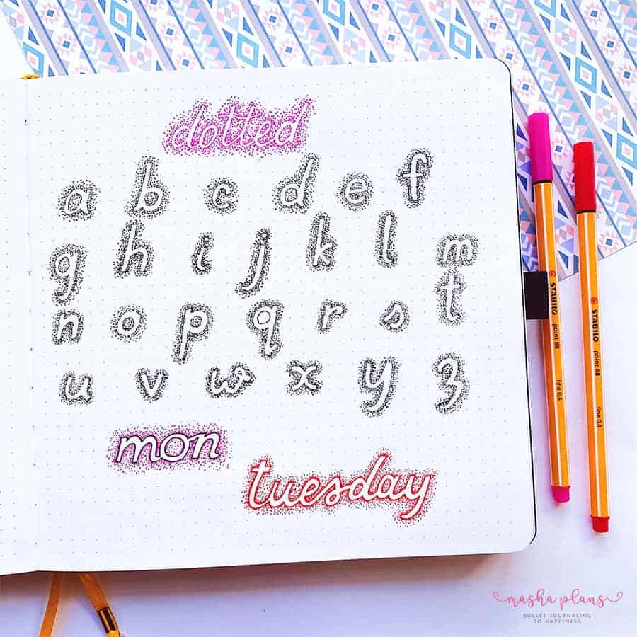
Here is how I did this.
You start with a pencil drawing of a letter, and it’s better if it’s a thick letter.
After that, you start drawing dots to form the shape of the letter. Then you just keep adding dots around it.
Spread your dots away, and the further they are from the letters, the fewer dots you’ll have.
As you can see, there’s also another option, which is to outline the letters and then add dots. This usually makes the letters better visible.
Easy Fonts: 90’s Font
The 90s were a good time, full of fun and bright colors that made for a very interesting and happy font.
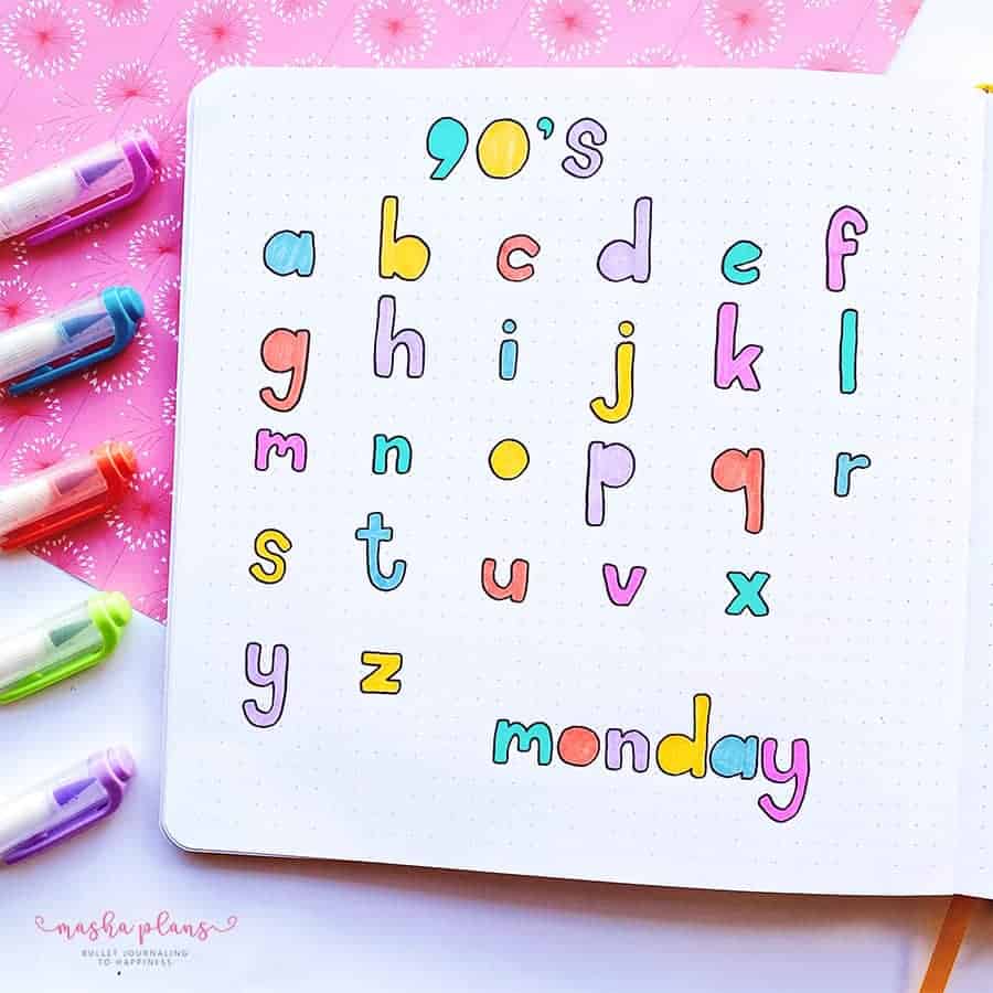
I feel like, apart from the ’90s theme, it would work very well for a theme like back to school.
This font is kind of like block letters, but with rounded corners and without circles in the letters. Pretty simple, but I think it looks quite bright and happy.
Handwriting Font
Your handwriting can be a great decoration for your Bullet Journal pages.
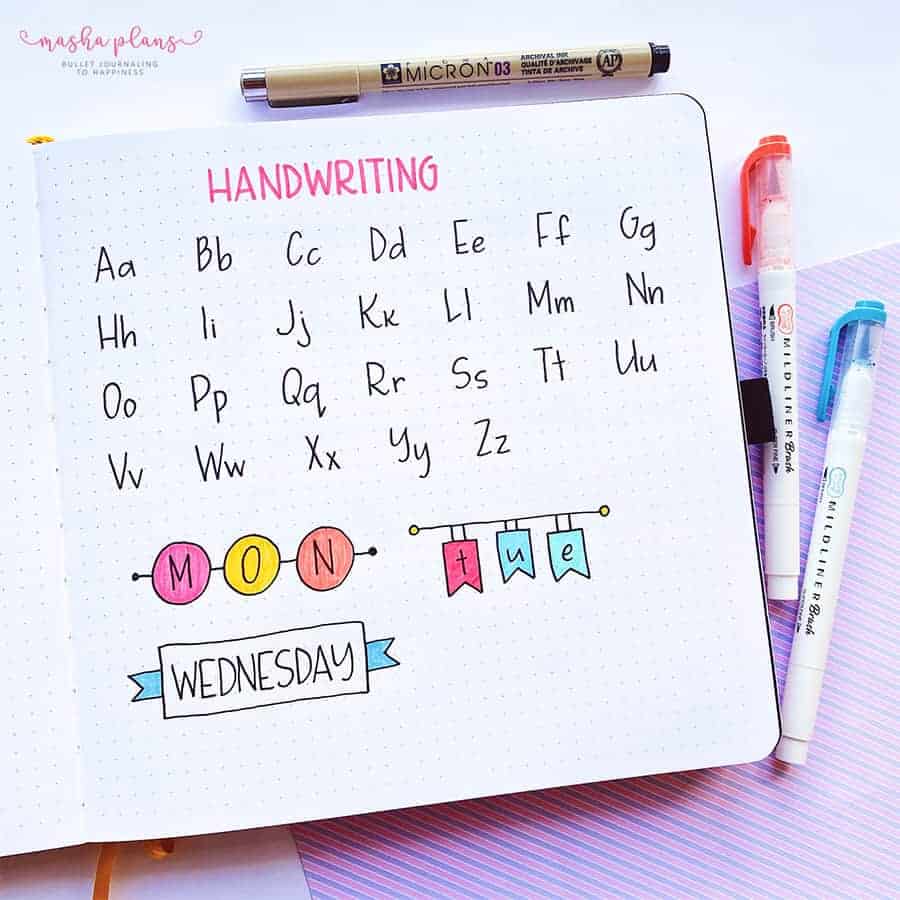
If you feel like just handwriting isn’t enough, you can use banners to add more fun to it.
Developing good handwriting is really just a matter of practice, so don’t worry if your letters don’t look perfect on the first try.
Billboard Font
I honestly just called it that way because it reminded me somehow of old neon billboards.
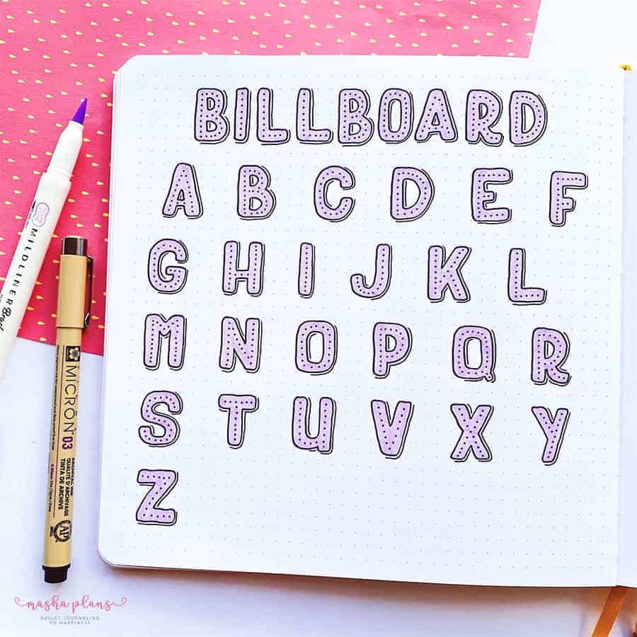
For this alphabet, I chose what’s probably my favorite color of Zebra Mildliners, but I feel like a neon color would also work very well.
It’s pretty easy to create as well – just do block letters with rounded corners, add dots in the middle, and an offset outline on one side of the letter.
I always use the right side, but you might as well use the left one – depending on your preference.
Offset Font
I love this one and how fun it looks!
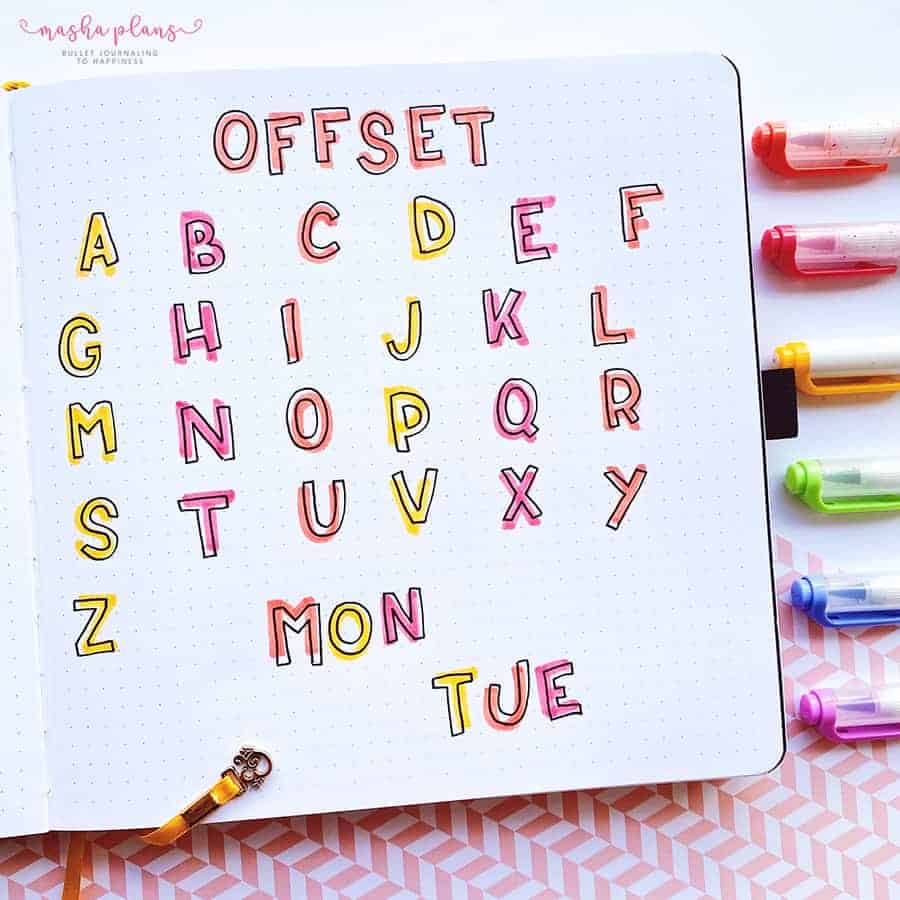
This font is super simple – use a colored marker to write a letter, and then add a black pen outline of this letter, but offset it a little bit.
The easy part? Your letters don’t need to be perfect. The whole point is to make this look quirky and uneven, so really don’t worry about it,
Shadow Font
This is the first time I have tried this one, and I love this effect so much!
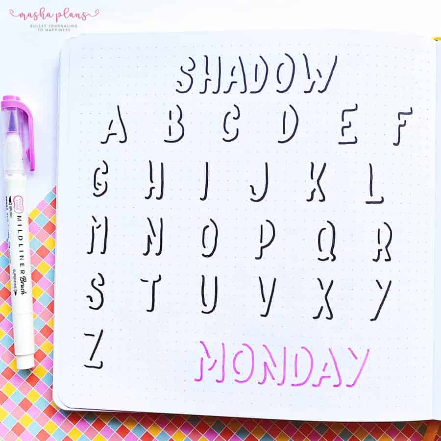
Basically, what you do is just draw a shadow of your letter. As you can see, with just a shadow, you can still recognize all your letters.
Just be careful how you do your shadows because here, for example, I feel like I made a small mistake with my N.
If you aren’t sure yet, you can just draw the shadows. Start by drawing your letter in pencil, and then add a shadow with a pen.
That’s actually how I did it – I was too worried about preparing all this for this post, so I needed things to be perfect. And yet I still notice that I forgot to add W; thankfully, you can see it in the title.
Creativity Freebies
Want to learn more about different ways you can add creativity to your journal?
I’ve got you covered with this free email course, where I’ll share with you ideas and resources on how to unlock your creativity.
Plus, you’ll also get 3 exclusive printables to help you with that.
Once you sign up in the form above and confirm your subscription, you’ll start getting all the exclusive freebies and information straight to your inbox.
Creativity is a muscle and not a hidden talent only a few have. Let me help you find it within and start making pretty Bullet Journal pages you’ll be proud of.
More Resources
Fonts can be a fun way to decorate your Bullet Journal pages, and there is, of course, so much more to explore. So check out these posts next:
- 7 Simple Font Ideas For Your Bullet Journal
- Simple Title Ideas For Your Bullet Journal
- 11 Free Online Hand Lettering Courses
>>> Which one of these fonts do you like the most? Share with us in the comments!
I hope this post was useful; if you find it so, please share! If you enjoy my content and want to show your appreciation, please consider supporting me with a cup of coffee.
And remember: Keep Bullet Journaling, and Don’t Be A Blob.




I used your fonts for my math prodget in class! Keep up the great work!!!
Glady ou enjoyed them and hope it helped you with your project =)
Love love LOVE the flower font! The offset font is really cool too and would help cover up all of my mistakes. 🫠 Thanks so much for these!!
So glad you liked these! The offset one is perfect for mistakes hahah