31+ Bullet Journal Design Ideas To Inspire Every Page

There are plenty of Bullet Journal ideas that can turn a blank page into something you actually want to open every day. I’ve been Bullet Journaling since 2018, and in that time I’ve tried nearly every cover style, header trick, and layout format.
This post pulls it all together in one place: Bullet Journal design ideas to inspire your BuJo covers, headers, layouts, minimalist pages, and decoration techniques.
Grab your favorite pens, and let’s find the styles that actually feel like you, no matter your skill level or how much free time you have this week.

This blog post is a big mix of spreads and designs to help you customize a journal of your dreams. We will cover everything – from design ideas for your cover page to tricks on how to decorate your journal.
I will share my own pages where possible, and if it’s a style I haven’t tried yet, I’ll share examples from other fantastic creators who’ve mastered the idea.
Be sure to scroll to the end for FREE printables to help you try new pages and decorate your existing layouts.
This post may contain affiliate links. They will be of no extra expense for you, but I receive a small credit. Please see my Disclosure for more details. Thank you for supporting Masha Plans!
Bullet Journal Cover Ideas
Your cover page sets the tone for everything that follows, so it’s usually where I start when I’m trying out a new design idea.
I love that cover pages work as a clear divide for the new month to come, and it’s one of the few pages in your journal that you don’t have to overthink – there are no worries about functionality; it’s all just about fun and creativity.
So, here are a few design ideas for you to experiment with.
Doodle Cover Page
That is my go-to format, sicne I love doodling, and usually my themes are all based on some kind of themed doodles.
The idea is easy – fill out your entire cover page with doodles that fit the theme you’re trying to create this month. I also like adding the name of the month to it, sometimes I would add a mini monthly calendar or maybe a quote.
But it’s really up to you what you think looks best on your cover page.

Watercolor Wash Covers
There’s something so calming about starting a new month with a loose watercolor wash across the page. You don’t need to be precise; the imperfection is the whole appeal, and it looks incredible with a little gold pen lettering on top.
One thing to mention: make sure your journal can handle watercolor, and aim for 160 GSM paper. Most journals these days have that paper, but it’s still good to check.
As always, I’d recommend Archer & Olive, sicne they have high-quality paper and adorable designs. Plus, you can get 10% OFF with my code MASHA10.
Watercolor isn’t really a strong medium, but here’s a beautiful example from another creator.
Photo Collage Covers
If drawing isn’t your thing, a collage cover is such a fun workaround. Print a handful of photos from your phone, layer them with washi tape, and you’ve got a cover page that’s personal in a way no doodle ever could be.
You can print photos from your gallery, or look for Pinterest images and use them to create a certain aesthetic.
I don’t know what this creator used, but for me, when it comes to adding photos to my journal, it is always about HP Sprocket – it’s convenient, doesn’t need ink, and the printing paper already comes as a sticker, so it’s very easy to stick right away.
Kraft Paper Covers
I go back to kraft paper constantly, especially in the fall. It adds this cozy, textured feel to the page before you’ve even drawn a single thing, and white or gold ink shows up beautifully against it.
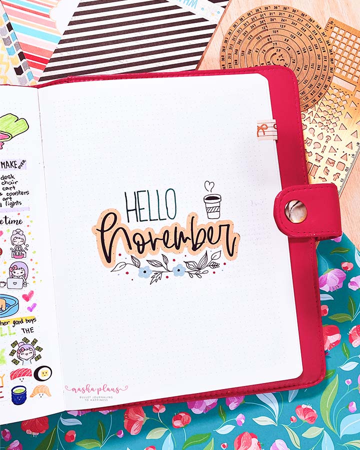
In this layout, I used my printer and Silhouette Machine to print and cut out kraft paper and create headers for all my monthly pages, but there are other ways to add kraft paper to your cover page.
You can use kraft paper to create little corners, make it a background for your header, or mix it with other paper to create borders. Here is another example from my old journal.
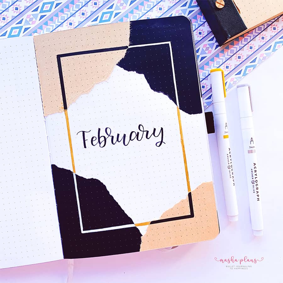
And in case you wonder, the kraft and black paper are from Archer & Olive notepads, which now come in the same 160 GSM paper, but also with a dot grid.
Single-Line Illustration Covers
One continuous line, no lifting your pen. It sounds intimidating, but it’s actually one of the most forgiving styles out there, since a slightly wobbly line just reads as ‘artistic.’ Perfect for when you want something intentional-looking that takes ten minutes.
You can also enhance this idea by using different background colors or adding several one-line illustrations.
Floral Cover Page
Florals are some of the most popular things to draw in your Bullet Journal, and in fact it’s been the first theme I’ve ever created in my very first Bullet Journal.
There are many ways to approach this idea – you can do it in black and white or in color. You can use just one flower or create big compositions.
Here’s an example from my very first journal, where I use little floral and botanical doodles to decorate.

Another thing I love about floral ideas is that each season has an associated flower, so you can play around and signify the season with specific florals.
Here is an example of my July cover, where the theme was sunflowers, which for me are summer flowers.

Bullet Journal Header Ideas
Headers might honestly be the single easiest way to make a plain page feel designed. There are so many ways to customize them that you’ll definitely find something unique and true to your style.
You mix different fonts, colors, and banners to eventually come up with the perfect header for your layout, and even if you’ve never done anything creative, you will be able to find a style you can recreate.
Bubble Letter Header Ideas
Bubble letters are forgiving, beginner-friendly, and endlessly customizable. Outline your title in big, rounded letters, then fill it with color or patterns, or leave it hollow for a more minimalist look.
You can also play around with the bubble style concept and make your letters take any shape you want. Just check out the example below.
Banner Style Headers
Wrapping your title in a ribbon or banner shape adds instant polish and draws the eye straight to the top of the page.
The great thing with banners is also the fact that you can play around with the shape, with how many flops it has, how you color the shadow, as well as the colors you use for the banners themselves.
Once you’ve drawn your banner, add text inside to create a cute header.

Faux Calligraphy Headers
If you don’t have a brush pen (or the patience for one), faux calligraphy is your best friend. Just thicken the downstrokes of your regular cursive handwriting after the fact, and it reads as calligraphy with none of the learning curve.
My tips are: once you write the word, try adding thickness on the same side of each letter. For example, in a downstroke, you can thicken from the outside of the letter or from the inside. Pick one and follow the same direction for each letter – that will help keep it more unified and even.

Doodle Frame Headers
Surrounding your title with small doodles, like leaves, stars, or little icons related to your theme, is such an easy way to make a plain header feel intentional and on-theme.
This could also work for adding sections to your planning pages – make the frames bigger, and they will help you create a section that draws attention – perfect for sections like priorities in your weekly spread. Or make them smaller to work for your little headers.
White On Black Effect
This is my all-time favorite effect for any of my headers, and it is also a great idea in case you made a mistake (like writing the wrong date or day of the week); that way you can cover it in black and use the white pen on the top, and nobody will know.
I use this effect even when there are no errors, and for a white pen I find that Sakura Gelly Roll are absolutely the best.

Weekly Bullet Journal Layout Ideas
Weekly layout is where function meets design, and it’s honestly the hardest part to get right, since it has to look good and actually work for how you plan.
Given how many weekly spreads we have to create every year, I think it helps to have a few ideas and inspirations for designing them in a way that works and excites you.
Grid-Based Layouts
A clean grid is the easiest way to make a page look organized and intentional, even without any decoration. Organizing and dividing your layout into sections helps keep things organized and fit more into your layout.
Asymmetrical Layouts
Not everything has to be evenly divided. Yes, you should mostly try to keep things the same size, but it is also totally OK to go wild and freehand.
Even if your boxes are asymmetrical and don’t match, it doesn’t mean it will not help you stay productive. Plus, isn’t it very fun from time to time to break the “rules”?

Column Layout Ideas
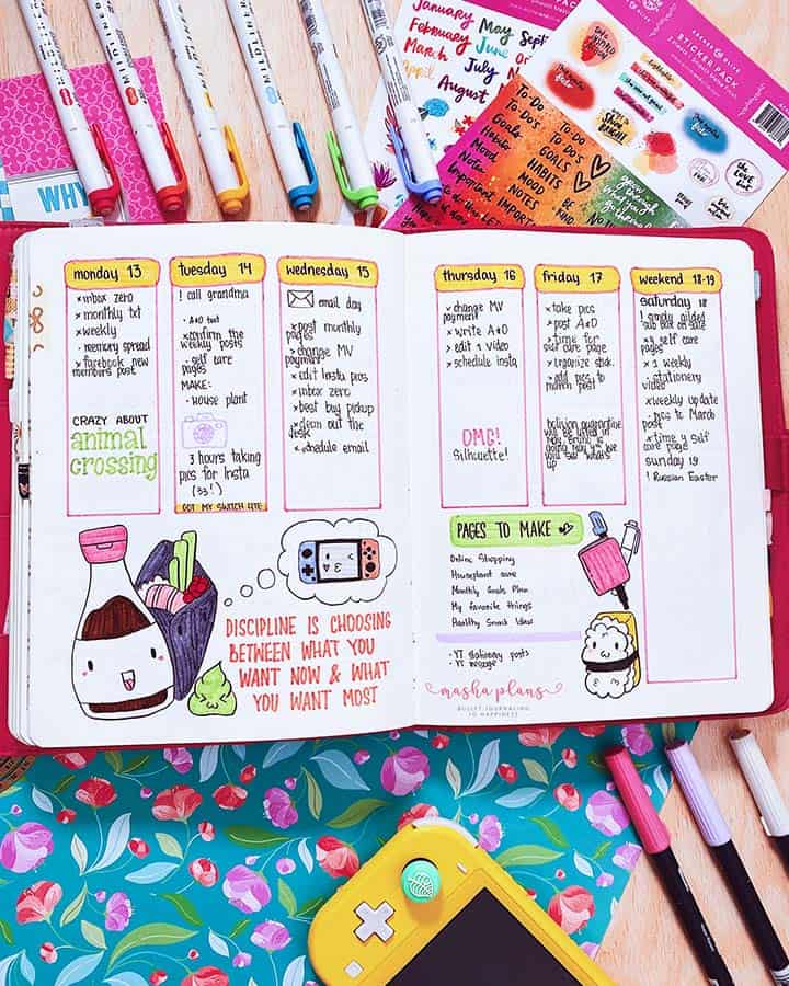
Vertical columns are one of my personal favorites for weekly logs, since I like having my to-do list in a vertical format with everything stacked; visually, it helps me understand my schedule better.
As you can see in my example, it also gives you plenty of space to decorate your journal or add more details you might need (like a meal plan or a habit tracker).
Dutch Door Layout Ideas
The Dutch door trick works beautifully for weekly spreads, especially if you need more space for your planning. This works if you need more space for day-to-day planning, or if your weekly spread has more categories that fit on two pages.
I know it can feel scary to cut into your journal, but it’s not a big deal, and you can start by folding the page and using adhesive if you want something a bit less permanent.
Minimalist Bullet Journal Ideas
If all of this sounds like a lot, minimalist design might be more your speed, and there’s nothing wrong with that. I actually think minimalist pages take just as much intention as elaborate ones; you’re just being very deliberate about what you leave out.
I always admire people who go minimalist with their layouts – I think it is such a beautiful aesthetic, and for me it can be so hard to master it!
Single Accent Color Page Ideas
Pick one color, usually your favorite pen, and use it as the only pop of color on an otherwise black-and-white page. It’s such a simple trick, but it makes the page feel curated instead of empty.
For me, this is a saving grace – I am too connected to colors, so doing pure black-and-white design is almost impossible. But adding just one color seems like a good compromise – I can still make a simple minimalist page while still using colors.

Typography-Only Pages
Sometimes the design is the lettering. A page with a beautifully written title and nothing else can look more polished than one covered in doodles, even if sometimes it takes even more time than just doodling.
Negative Space Layout Ideas
Don’t be afraid of blank space. Leaving generous margins and gaps around your content is a design choice in itself, and it makes whatever you do include feel more important.
I think this is an incredible skill, and those pages look stunning and very clean. Personally, I get nervous with too much empty space, so I always end up filling it out at some point.
Journal Layouts With Patterns
This is on the list for minimalist ideas because I think it looks very clean, and the patterns can also be as simple as you want them to be. Plus, patterns are just one design repeated over and over, so they’re easy to replicate.
Moreover, patterns are calming and meditative to draw, so they’re a fun thing to explore in your journal.
Bullet Journal Decorating Ideas
This is the category I get the most questions about, since ‘decoration’ can mean so many different things.
Many of these ideas focus on stationery, sicne it’s the easiest and fastest way to decorate your journal. So here are a few ideas you might want to try.
Washi Tape Borders
Washi tape is genuinely the easiest decoration hack. Here are several ways to use washi tape, starting with page borders.
Another way to use washi tape is to divide areas on your pages. Basically, use washi tape instead of drawing lines.
For me, who is allergic to rulers, using washi tape that way was a very fun shortcut.

Finally, you can use washi tape to decorate your journal pages and fill in any empty spaces.
There are so many different styles and kinds of washi tape that you might not even realize someone used washi tape. I recommend you check out this shop for all things washi; they have an incredible collection.
Stamped Accent Ideas
A small stamp collection goes a long way. I like keeping a few simple ones on hand (florals and little icons are my favorites) for when I want decoration but don’t have the energy to doodle.
Another type of stamp is the functional ones, and those are the ones I use even more – the right set of stamps can help you easily create headers and help you speed up your page setup.

Sticker Cluster Ideas
Grouping a handful of stickers together in one corner, rather than scattering them across the page, tends to look much more intentional and put-together.
You will also find it useful to have functional stickers – cute for the headers and for the dates. This lets you create pages that are cute, functional, and take just a few minutes.

Stencil Patterns
Stencils are perfect for filling in blank space with a repeating pattern, like tiny hearts or leaves, without needing to freehand anything. They’re especially great for borders and corner accents.
If you use soft light colors, you could use them for the background as well, like in this beautiful example.
Bullet Journal Color Palette Ideas
Your color choices do more heavy lifting than almost anything else on the page, so it’s worth thinking about intentionally instead of just grabbing whatever pen happens to be closest.
Monochrome Palettes
Sticking to different shades of a single color (all blues, all greens) is one of the easiest ways to make a page look cohesive, even if you’re mixing several different design elements.
But I must say, when I hear monochrome, I mostly think of black and white, so I wanted to include an example of that as well.
And if you do want to go monochrome in that way, I can’t recommend enough the greyscale Tombow Dual Brush set; it has all the shades you need!
Seasonal Palette Ideas
Letting the season guide your color choices- warm oranges and browns in fall, soft pastels in spring- is an easy shortcut when you don’t want to overthink a new monthly setup.
For example, here is my July cover page, created in bright, happy colors that I think are perfect for the season.

Pastel Palette Idea
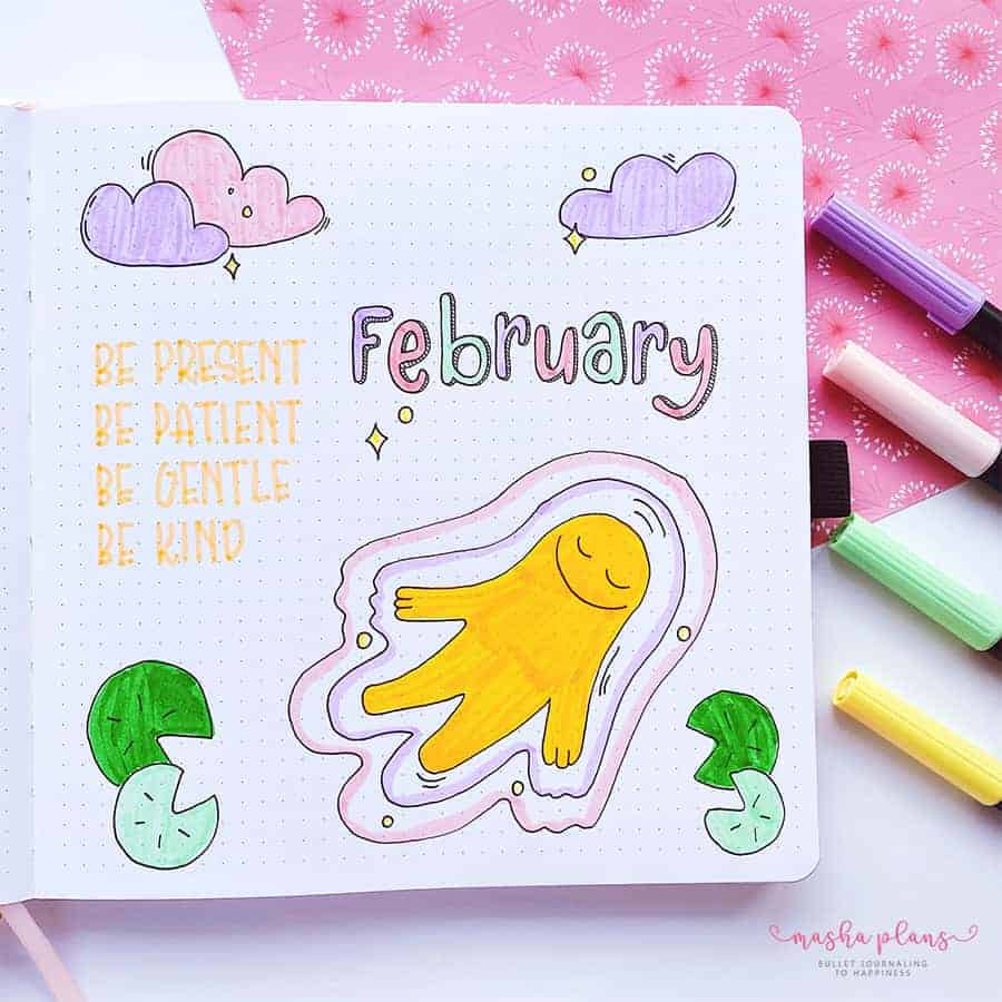
Soft, muted tones give pages a gentle, dreamy feel, and they’re especially forgiving if you’re still building confidence with color combinations.
For example, here is the cover page for the month when I followed a meditation theme by recreating the aesthetic of my favorite meditation app (add 🧡 in the comments if you know the app).
Jewel Tone Palettes
Deep emeralds, sapphires, and burgundies make a page feel rich and a little more dramatic, which I love for winter setups or anytime I want something a bit more elevated.
This isn’t exactly winter-themed, but that burgundy snake definitely made me think of jewel colors.
Colors As Theme
We talked, and I showed you different color palettes, but I haven’t mentioned that you can build an entire journal design based on color alone.
No need for doodles or any other decorations – pick a few colors (preferably the two that look good together) and add them to all the pages to make it look more cohesive, and there you go!

Free Journal Printables
As always, I’ve got some freebies waiting for you already in the Resources Vault, including cover pages, trackers, and layout templates you can use to try a few of these ideas out without starting from a totally blank page.
Moreover, you will find so many stickers in all possible styles – print and use them in your journal to create your own unique and fun layouts!
If you don’t have access yet, you can always sign up in the form below.
Once you confirm your subscription, you’ll get the password to get 50+ free Bullet Journal printables, stickers, and worksheets to use right away.
If you’ve never used printables before, be sure to check my post How To Use Printables In Your Bullet Journal.
It’s pretty basic, and you can find all the supplies you need in my post Supplies For Using Bullet Journal Printables.
More Resources
This is just a starting point, and I have plenty more posts with ideas and inspiration.
Check out these next:
- 13 Aesthetic Cover Page Ideas
- 90+ Bullet Journal Header And Title Ideas
- 9 Creative Ways To Decorate Your Journal Pages
>>> Which of these Bullet Journal design ideas are you trying first? Let me know in the comments!
Hope this post was interesting. If you find it so, please share! If you enjoy my content and want to show your appreciation, please consider supporting me with a cup of coffee.
And remember: Keep Journaling, and Don’t Be A Blob!