7 Bullet Journal Header Font Ideas To Elevate Your Pages

If you’ve been seeking fresh Bullet Journal title ideas, you’re in the right place!
Ever thought about how different fonts can easily add a dash of decor to your pages? It’s true – and it’s simpler than you might think.
With the right header font ideas, you can inject color and interest into your Bullet Journal entries. Whether you’re a seasoned journal enthusiast or a beginner just getting your feet wet, experimenting with fonts is a fun and creative way to personalize your pages.
So, let’s dive in and explore some font ideas that will elevate your Bullet Journal to new heights of creativity.

Fonts are like the secret ingredient in a delicious recipe – they add that special touch without being overly complicated.
Think of them as the sprinkles on your Bullet Journal sundae. You don’t need to be Picasso or Da Vinci to draw these.
With just a bit of practice and a sprinkle of enthusiasm, anyone can master the art of creating beautiful headers with this type of Bullet Journal lettering. It’s all about letting your personality shine through your pages.
And the best part? The fun you’ll have while exploring different fonts. Imagine each page as an exciting new canvas, ready to be filled with your unique creativity.
And be sure to scroll until the end to get some more ideas, as well as some amazing free resources to help you add a spark of creativity to your Bullet Journal pages.
This post may contain affiliate links. They will be of no extra expense for you, but I receive a small credit. Please see my Disclosure for more details. Thank you for supporting Masha Plans!
Stationery Recommendations
There are so many supplies to choose from, and I’m sure you want to pick the ones you’ll love using the most.
So here are a few of my favorites, especially for creating headers:
- Sakura Pigma Micron – these are some of the best fineliners, perfect for creating all types of elements in your Bullet Journal. Their black archival ink will make all your headers look sharp.
- Tombow Fude Brush Pens – my favorite small tip brush pens will allow you to create the most intricate headers, especially with smaller elements. Plus, of course, you can use them for brush lettering.
- Crayola Super Tips – these are some of the best markers out there, since they come in so many colors and are pretty affordable.
- Tombow Dual Brush Pens -if you’re looking for something extra, these brush pens are it! They have tons of colors and double tips, so you can use a brush tip for lettering and a marker tip for adding smaller elements.


Now, with supplies ready, let’s get into some fun fonts you can use for your headers!
Header Font Ideas
Oh, the joy of fonts! It’s like walking into a candy store, but instead of sweets, we have an endless array of styles to choose from. And let’s not even get started on the colors – it’s a rainbow waiting to leap onto your pages.
But hey, before we dive headfirst into this creative pool, let’s take baby steps, shall we?
So cozy up in your home office, get your favorite cup of coffee, light a candle, and let me introduce you to these 7 font ideas. These are easy-peasy, no fuss, and guaranteed to add that extra ‘oomph’ to your Bullet Journal.
Heart Font
Let’s start with something very simple. You’re starting with a basic print – nothing fancy, just your everyday handwriting. That’s your canvas.
Here’s how I like to do it: Grab a pencil and sketch out your letters. Don’t worry about making them perfect; we’re just setting the stage here. Once you’ve got your letters down, it’s time to bring in the color brigade.
I went with hearts because, well, who doesn’t love a bit of extra love on their pages?
Next, it’s time to take your trusty pen and solidify those letters. Now they’re ready to stand proud on your page!
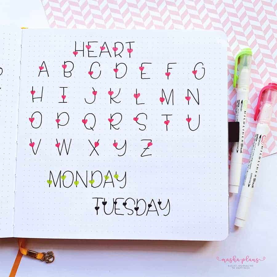
But hold on, the fun’s not over yet! This is where your creativity gets to run wild.
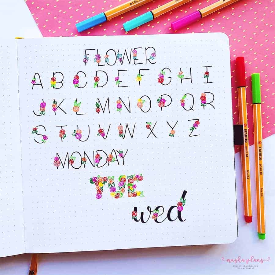
Fancy adding some stars for a night-sky vibe? Go for it! How about clover leaves for a St. Patrick’s Day theme? Absolutely! Or perhaps flowers to usher in the spring?
Faux Calligraphy
Ever tried to master brush lettering and thought, “Well, this isn’t as easy as they make it look!”? Don’t worry, we’ve all been there! But guess what? There’s a nifty little trick called faux calligraphy that can help you achieve the same effect without the brush pen gymnastics.
Here’s the scoop – you simply jot down your words, then go back and give some extra love to those downstrokes, making them thicker. It’s like giving your letters a little weightlifting routine!
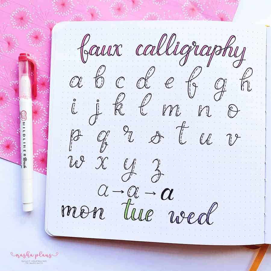
But here’s where it gets really fun. The thick parts of your letters? They’re your personal playground!
You can doll them up with different colors or sprinkle in some patterns if you’re feeling extra adventurous. It’s your Bullet Journal, your rules!
Modern Font
I’m not sure if you’ll agree, but for me this font screams art deco. It’s like a jazz band for your Bullet Journal – modern, chic, and oozing with that 20s vibe.
Now, because I’m all about making things easy for you, I’ve gone ahead and jotted down the whole alphabet in this style.
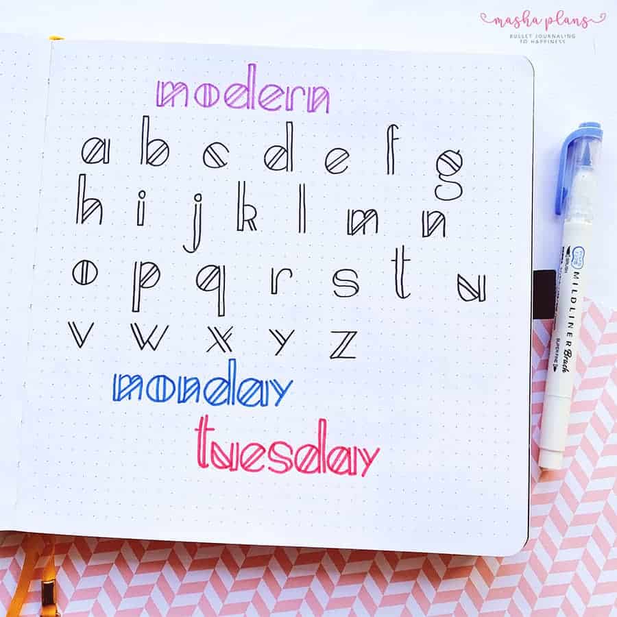
But here’s the best part: this font is as simple as a Sunday morning. It’s all straight lines and right angles – think of it as a geometry lesson but way more fun.
So grab your ruler, and you’ll be churning out letters that look as sharp as a Gatsby party in no time.
Easy Fonts: 90’s Font
Ah, the 90s! A decade of vibrant colors, catchy tunes, and unforgettable fashion. It’s like a little time capsule of joy, isn’t it? And guess what? We’re about to bring that joy right into your Bullet Journal with this cheerful font.
I mean, who wouldn’t want a dash of 90s nostalgia brightening up their pages? But that’s not all! This font is also a perfect fit for a back-to-school theme. It’s like the cool new backpack of fonts – fun, practical, and guaranteed to make you smile.
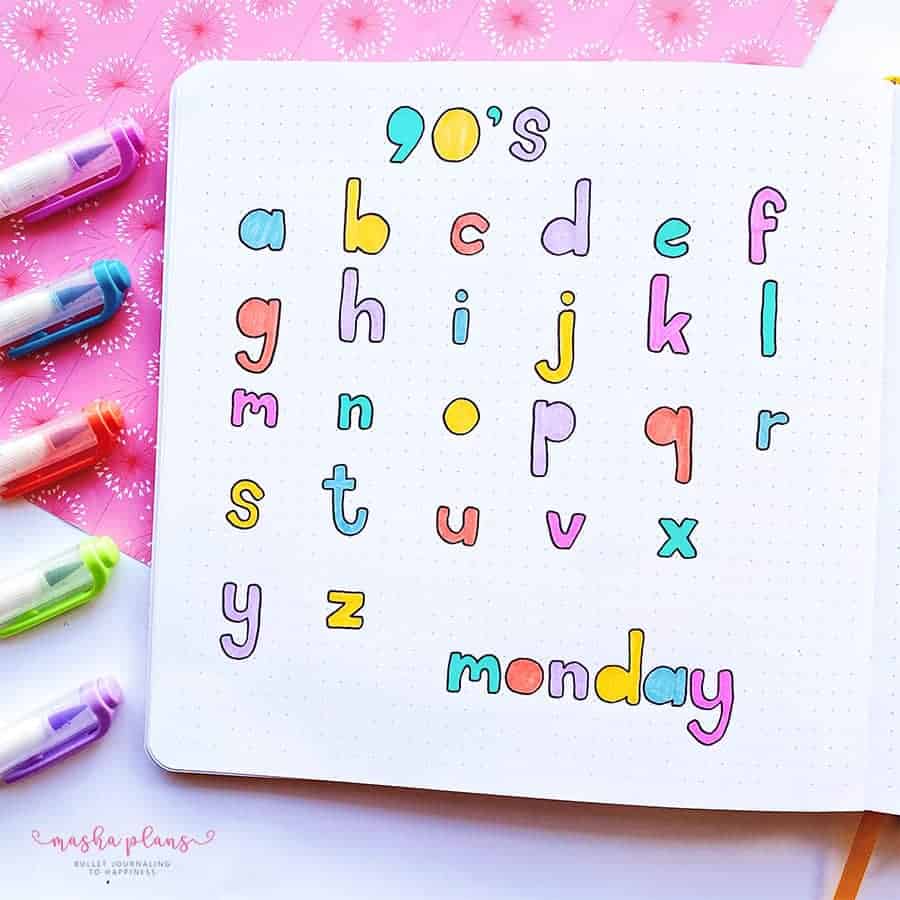
Here’s what you need to know: think block letters. Now, soften those corners and take out the circles in the letters. Voila! You’ve got yourself a 90s-inspired font that’s as easy to create as it is delightful to look at.
The 90s may be history, but who says we can’t bring a bit of its magic into the present?
Offset Font
Isn’t it amazing when simplicity and creativity collide? That’s exactly what happens with this super fun font!
Picture this: You grab a colored marker, write a letter, and then – here’s the twist – you take a black pen and trace an outline of the letter. But wait, not right on top. You offset it just a smidge.
And here’s the real kicker: perfection is not invited to this party. In fact, the more quirky and uneven your letters, the better. It’s like your Bullet Journal is throwing its own little rebellion against symmetry and order.
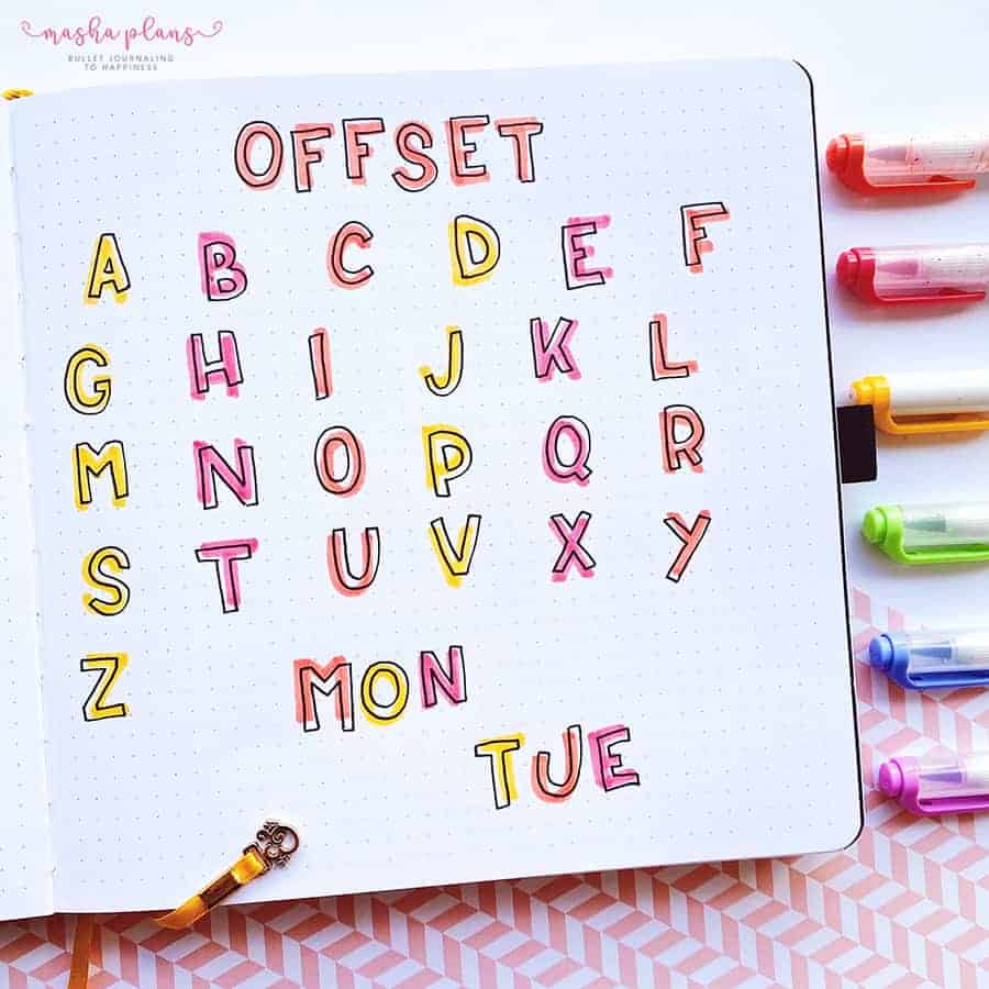
So let loose, embrace the unevenness, and watch as your pages come alive with this playful font!
Remember, Bullet Journaling isn’t just about organizing your life; it’s also about having fun along the way. And what’s more fun than a font that breaks all the rules?
Cursive Shadow Font
Get ready for a font that will make your Bullet Journal feel like a party! It’s like brush lettering’s fun cousin, always ready to brighten up your pages.
Here’s how you bring this party to life: First, you need two markers – one darker and one lighter. Think of them as the dynamic duo of your font adventure.
The darker one is your hero, boldly crafting the cursive letters on your page. The lighter one? That’s your sidekick, adding a soft shadow to each letter, making them pop right off the page.
It’s like adding a 3D effect to your journal but without those funky glasses. And the result? A font that looks as if it’s been brushed onto your pages with all the care of a master artist.
Billboard Font
Oh, the nostalgia of old neon billboards! They have this unique charm, don’t they? That’s what inspired the name of this font. That’s what it reminds me of, but if you have a better name – share it with us in the comments!
Now, let’s talk colors. I went with my go-to Zebra Mildliner shade for this one. But here’s a fun twist – how about trying a neon color? Imagine the pop of vibrancy it would bring to your pages. It’s like your Bullet Journal is hosting its own little light show!
The best part? Creating this font is as easy as pie. Picture block letters but with softer, rounded corners. Then, add a sprinkle of dots in the middle, and an offset outline on one side. I’m partial to the right side, but hey, if you’re a left-side kind of person, go for it!
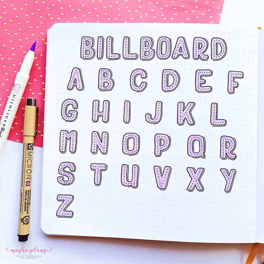
Remember, Bullet Journaling is all about making it your own. So, whether you’re a right-sider, a left-sider, or somewhere in between, this font is ready to light up your pages.
Creativity Freebies
Eager to sprinkle some creativity into your Bullet Journal? Yearning for a dash of uniqueness in your headers, doodles, and more? You’ve come to the right place!
I’ve whipped up a little surprise just for you – it’s like a magic creative potion for your journal. And guess what? It’s absolutely FREE!
Just sign up and confirm your subscription, and voila! You’ll receive daily emails brimming with resources and ideas to add a creative twist to your journaling journey.
But that’s not all! You also get three EXCLUSIVE FREEBIES designed to ignite your imagination and infuse your Bullet Journal with your unique flair.
More Resources
There is always more when it comes to decorating your Bullet Journal, and I share a lot of ideas and inspirations here.
So check out these posts next:
- Bullet Journal Header Ideas With Highlighter
- Easy Header Ideas For Your Bullet Journal
- 9 Creative Ways To Decorate Your Journal Pages
>>> What font did you like the most? Share with us in the comments!
Hope this post was interesting. If you find it so, please share! If you enjoy my content and want to show your appreciation, please consider supporting me with a cup of coffee.
And remember: Keep Journaling, and Don’t Be A Blob!