
Poetcore Aesthetic Journal Inspirations

Bullet Journal theme ideas come in all forms — from pastel floral spreads to minimalist monochrome layouts — but few capture the soul of journaling quite like a poetcore aesthetic journal. This trend is having a serious moment right now, and honestly? I completely understand why.
Poetcore draws from the rich visual world of 19th-century Romantic poets: candlelit writing desks, leather-bound notebooks, soft earth tones, flowing script, and botanical details that feel lifted straight from a poem by Emily Dickinson. It’s moody without being dark, romantic without being overdone, and — here’s the best part — it translates beautifully onto a Bullet Journal page.
If you’ve been scrolling Pinterest lately and saving every cream-and-olive spread with pressed florals and fountain pen lettering, you’re already living the poetcore dream. Now it’s time to bring it to life in your journal.
In this post, I’m sharing my favorite poetcore-inspired Bullet Journal page ideas so you can start building a journal that feels like a quiet, candlelit corner of a great library.
Grab your favorite pen, make yourself a hot drink, and let’s get into it.

I’ll be honest here: as much as I love this aesthetic, it is not something I do personally. I tried creating something with the dark academia feel, and it always felt out of place in my journal.
I am all about bright colors and fun doodles, as you might’ve noticed if you checked some of my other posts here.
However, there are plenty of other creators who are incredible at creating poetcore-style layouts, and here I’ll share some of the best pages I’ve ever seen! Just because it’s not my personal style, it doesn’t mean I can’t appreciate or collect plenty of incredible layouts for you to get inspired by.
This post may contain affiliate links. They will be of no extra expense for you, but I receive a small credit. Please see my Disclosure for more details. Thank you for supporting Masha Plans!
Poetcore Aesthetic Journal Inspirations
One more thing – the pages that are considered poetcore really depend on your own definition. For me, it’s something soft and cozy, something in a bit of a dark academia style, with beautiful handwriting and kraft paper.
So this is exactly how I picked the layout for this post, and I’m sure you’ll find them just as inspirational. So let’s dive in!
Poetcore Weekly Spread
Let’s start with a more traditional Bullet Journal type of page – a weekly spread. I love that this creator kept it practical, leaving enough space to plan every day, while also adding plenty of decorative elements to create a unique, aesthetic feel.
Daily Journaling Page
When speaking of poetcore journaling, I think first and foremost about beautiful handwriting and fountain pens. This layout is a perfect representation of this, and it’s a fun approach to journaling – the creator didn’t just write but also added stickers and other elements to make the layout look more stylish.
You can see they added the decorations before writing, and I think it works very well for journaling, because writing around stickers really creates an interesting and stylish effect.
Poetcore Cover Page
A cover page is one of my favorite Bullet Journal pages; it’s a perfect place to simply get creative without thinking of utility.
This cover page perfectly represents the poetcore aesthetic and can give you a few ideas for creating the same feeling in your pages.
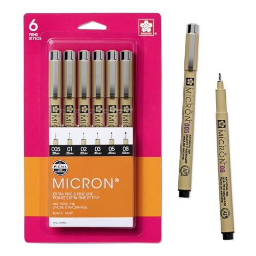
A takeaway for me is to use book pages from any of the books you would send to recycling, use thin-tipped fineliners and brown markers.
Poetcore Style Monthly Log
This layout is beautiful, and it shows you something important – that you can journal in any type of notebook; it doesn’t have to be a grid guide.
I also love this person’s creative choice to use small illustrations and pictures to decorate the page.
Travel Journal Page
Travel journaling is a fun and creative way to remember all your incredible memories, and with all the little tickets and pictures you get, it’s like you already have pre-made decorations for your pages.
This page and this creator perfectly show you how to take all those papers and turn them into a stylish poetcore journal page.
Morning Journaling Page
One more beautiful journaling page, and everything about it screams poetcore for me. I love that the creator managed to find those stickers and washi tapes that are very in line with this aesthetic, as well as with the whole content of this journaling page.
I also see that a lot of poetcore-style journals are travel-size, and the more I see them, the more I feel like it is a perfect fit!
Habit Tracker
This habit tracker is very stylish, and I think it fits the aesthetic of the other pages in this post. The only thing I would mention here is that it looks amazing, and as long as it works for you, it’s great. But always remember that the important thing is to make it functional for you.
For myself, I know when I create complicated pages like these, I often end up not using them. So I just want to remind you that aesthetics are incredible, but the important part with every journla is that it works for you and helps you with whatever you need help with.
Reading Journal Page
It’s in the name of aesthetics, isn’t it? It’s a perfect journaling style for your reading-related pages. Here is a beautiful example of a book review page. I love that this creator used that dark floral washi tape – it really created a dark academia vibe to this layout.
Quote Page
This quote page is a bit of a different approach to a poetcore style. Here, the creator went for gentler, pastel colors. This is a wonderful example of how you can play around and add your own spin, even if you’re working within a specific style.
I also love how this creator used simple fonts for the quote. You do not need to be a master of brush or hand lettering to create something cute and inspirational.
Romantic Habit Tracker
I think this habit tracker is on the more romantic side, with the creator using soft pastel colors and pink tones. But so can poetry, so I would say this is still very poetcore-aesthetic.
An interesting thing to note here is how the creator added little tabs on the pages and used the same washi tape to decorate them, keeping it all on theme and making it easy to navigate.
Reading Journal Cover Page
This is such a beautiful style; the creator really made an extra effort to give the layout a literary feel.
It’s another fun approach to add some more botanical elements to the layout. And I think it’s an interesting idea to add to the cover pages the names of the books (are these the books they have been reading, planning to read, or just finished?).
Poetcore Weekly Layout
Here is one more weekly spread, and following how I understand poetcore aesthetics, it has beautiful handwriting in the center of it as the main decoration.
This, honestly, is a wonderful example that if you want your page to look beautiful, it doesn’t mean you have to overload it with decorative elements. A few pieces of washi tape, a beautiful header, and neat handwriting are enough to make the page stand out.
Daily Log Page
This layout is not just beautiful; it also gives the creator plenty of space, whether they will use it to plan their day or to write their thoughts that morning.
I like that the creator used softer and lighter colors to make it almost a bit more romantic.
Book Journal Page
Another layout is a book review, and here I want you to notice a new, interesting effect the creator used. They used decorative and kraft paper to create a little border around the entire layout.
I love how it makes it look like a page of the book with burnt edges.
Aesthetic Journal Page
Last but not least is this beautiful daily journaling page. Again, it seems like the creator used washi and stickers to decorate the layout first, before writing. I also really like the cute cursive the creator uses here.
Let me know in the comments if you still write cursive; I definitely haven’t used it in so long I’m forgetting how to do some of the connections.
Poetcore Calendar Page
If you are a content creator, you’ll know how useful this page can be! But here we are also looking for an aesthetic, and I think this layout is in line with poetcore style.
I love that the creator used stickers for the headers – it’s really a quick way to add style to your layouts without spending weeks or months learning brush lettering.
Aesthetic Weekly Spread
Let’s finish this lineup with this beautiful weekly spread. I think with the colors and details this layout still counts as a poetcore aesthetic.
However, I think this creator also went for a more minimal approach, making this page a good example that you don’t need to spend hundreds of dollars on supplies to create something beautiful and stylish.
And there you go; here are just a few of the incredible poetcore-style layouts that I found for you. Let me know in the comments if you want to see more so I can dive deeper into this aesthetic and find more unique inspirations.
Stationery Recommendations
If you want to recreate a similar aesthetic, let me share a few ideas for supplies that can help you create this very unique and stylish look in your own journal.
- Kraft paper – I think this is one of the big things that can easily help create that poetcore feel, and I can’t recommend Archer & Olive notepads enough – it’s not just kraft paper, but it is also with a dot grid and the same 160 GSM quality. You can get 10% OFF with my code MASHA10.
- Stamps are an easy way to bring that retro aesthetic to your pages, and I think the letter stamps would work perfectly (you’ll see a lot of creators below using them).
- Washi tape is always a wonderful way to add something special to your pages, and you’ll see a lot of poetcore creators on this list using it. I think these washi tapes would be perfect.


More Resources
Are you looking for some more ideas and inspiration for a similar aesthetic? I have more for you to check out right away.
Get inspired by these posts next:
- Cozy Fall Bullet Journal Inspirations With Kraft Paper
- 17 Stunning Book Bullet Journal Page Ideas
- 31+ Brilliant Book Bullet Journal Theme Ideas And Inspirations
>>> What are your favorite ways to decorate when you’re trying out poetcore style? Share with us in the comments!
Hope this post was interesting. If you find it so, please share! If you enjoy my content and want to show your appreciation, please consider supporting me with a cup of coffee.
And remember: Keep Journaling, and Don’t Be A Blob!



Girl, I’m with you. I have hundreds of sticker sheets that are this cream/brown aesthetic and I just can’t get down with it. I’m all about the kawaii, bright rainbow doodle style of it all. I usually use sanrio or artists like applebottom or a creator called “tinyplant” for my journals. I want to use all these cool tags and pockets I’ve accumulated but they just have no place in my pastel rainbowcore world of a journal.
Ashlen, so happy to hear I’m not the only one!! I love all those pages so much but yeah…. You can’t do ALL the styles unfortunately haha